App wireframes, like website wireframes, visually depict the user interface of a mobile app so that you can see how the app will appear and function. You can quickly design, create, and iterate on your mobile applications with an app wireframe – without extra stages or conjecture.
Although creating an app wireframe might seem scary, it’s a simple and effective approach to begin developing your app. This blog post will bring you through a thorough explanation of app wireframing, including what they are, when you should use them, and how to create one that best meets your requirements.
Customized Mobile Apps to Elevate Your Business
Building Mobile Apps that Bridge Your Business with Your Audience
Explore Mobile App DevelopmentCurious about what an App Wireframe really is?
Wireframes are viewed as the foundation of every project by most designers. It’s the same with mobile app design. For iterating on mobile apps, an app wireframe is an easy-to-use and practical tool.
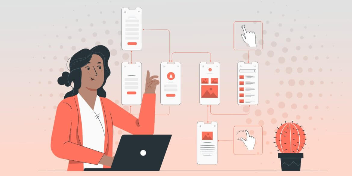
Using app wireframes, you can clearly show how your app is designed, including the navigational structure and the way users will interact with any important sections. Building a foundation for your app design with a wireframe allows you to debug any fundamental features before fine-tuning the app.
Mobile apps must operate on a very small screen, in contrast to desktop apps, which have a large amount of space at their disposal. It’s crucial to give yourself plenty of chances to identify any design issues as early in the process as you can. By doing so, you may distribute on-screen components like content and navigation in advance, better organizing and planning the creation of apps.
When Is an App Wireframe Necessary?
Early in the development of an app, teams create wireframes. Use an app wireframe to make sure the user flow is seamless and all critical functionality is there before you start creating content or finishing any designs. When you need to agree with your teammates on how the app will work, how users will interact with it, and what each element will look like, utilize an app wireframe.
However, app wireframes are not only necessary at the start of the development lifecycle. An app wireframe is a fantastic tool for brainstorming, redesigning, and testing design aspects, as well as garnering buy-in from your colleagues if you need to go back to the drawing board at any point.
Design for Success with Stunning UX/UI From Our Team
Investing in UX Design Can Yield a Return of Up to $100 for Every $1 Spent
Discover UI/UX DesignHow to Create an App Wireframe
While the wireframing procedure varies depending on the project and team, there are some fundamental similarities. Here are the essential steps in producing an app wireframe that results in a fantastic app experience.
- Create a target user flow map first. Similar to a user’s journey, a user flow describes the steps a user takes to accomplish a certain objective. It aids in your comprehension of the number of displays you must create and the nature of user interaction. Create a quick drawing to represent your ideal user flow once you have determined it.
- Select a frame that matches the size of a device that can run your app. Create a logical visual hierarchy for your app using this as a foundation. The visual hierarchy is the organization and layout that presents your app’s information in the manner in which you want it to be viewed. The sequence in which you wish to provide information to your users should be reflected in the layout you create.
- Start replacing placeholders and dummy text with an actual copy once you’ve agreed on a visual hierarchy and have a basic layout in place. You’ll be able to see how your content and design will work together without feeling rushed to finish the writing right away. Make layout changes as necessary to give your users the greatest possible presentation of your information.
- Add the actual copy once you’re certain that the placeholder copy looks good. Once the information is there, you can begin to test how the user will navigate the page. When people interact with your material, consider the path you want them to travel. To see how user experience (UX) moves between screens, connect your sites.
- You are now prepared to hear criticism. To help colleagues better grasp what each element and page are intended to perform, annotate your wireframe. On each screen, include reference numbers so that your team members can easily identify the area of your design they are giving input on.
- Examine your wireframe. Give your collaborators a link to all of your wireframes so they can check the flow. Give your team members the opportunity to use the app before asking them to respond to a series of questions. What benefit did they derive from the encounter? What did they enjoy and disapprove of? What was easier to understand and what was more difficult? In order to improve, compare your notes to the ideal user path.
If you want to find out more about what we do and how we can help your business, don’t hesitate to contact us.
Experience Our Research & Development Expertise
R&D-Led Software Development Integrates Innovation into Every Product Detail
Learn About R&D Services