In the contemporary world, the importance of mobile applications cannot be overemphasized, and they present themselves at every turn. From food delivery to bill payment to communication with friends and family, mobile apps are the key to more convenience and speed. In 2023, 257 billion app downloads were registered worldwide. Therefore, a well-crafted UX app ensures user satisfaction while driving engagement and loyalty.
In this article, you will discover 12 crucial tips for mobile applications’ design and usability supported by technical data and statistics.
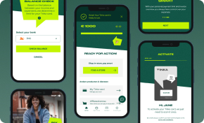
Customized Mobile Apps to Elevate Your Business
Building Mobile Apps that Bridge Your Business with Your Audience
Explore Mobile App DevelopmentSimplicity and Clarity
Usability is crucial for mobile apps. The PACMAD (People At the Centre of Mobile Application Development) usability model emphasizes three factors: User, Task, and Context of use. These factors impact the final design of a mobile app interface.
Minimalism
Minimalism is very simple in which all the unnecessary features and content are removed, and only basic features and content are left. One of the benefits of this approach is that it removes extraneous stimuli from the user interface while improving focus and attention. The design allows users to find the information they need quickly and without flashy distractions that obscure the information provided. Simplicity is characteristic of minimalist design, and this includes the intelligent use of space, restricted use of colors, and clear font to make the app attractive to use.
Some principles that might be helpful are:
- Less Is More: Prioritize essential features and content. Avoid overwhelming users with excessive buttons, icons, or text.
- Whitespace Matters: Use ample whitespace to give elements room to breathe. It enhances readability and draws attention to key components.
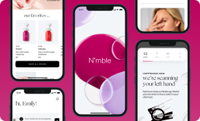
Boost Engagement Through Tailored UX/UI Design
Designing Impactful Digital Experiences That Foster Connection and Increase Sales
Discover UI/UX DesignNavigation
Another method related to the concept of simplicity and clarity is navigation, which is also a key factor in mobile applications. Live navigation facilitates a user’s journey in an application through the use of tab bars, hamburger menus, or swipe gestures. These navigation tools should be effectively and conveniently placed so that new users can easily interact with the application.
Easy and unambiguous website navigation implies that users will not be confused while trying to find certain components or data provided on the website. Structuring a mobile app to achieve a clear interface and simplicity in its navigation can lead to highly effective applications that promote the user’s engagement and satisfaction, which can result in their constant use of the application and even devotion to it.
Visual Hierarchy
Evaluating hierarchy in mobile application design is an important element as it helps to manage the user’s attention and facilitate the process of interaction and content perception. These characteristics determine the importance of another, and the closeness in size is the main reason for forming this hierarchy.
Size and Proximity
As you may well imagine, larger elements attract more attention and should be applied to the actions of the first priority or important messages, whereas the smaller elements will point to the secondary actions or less significant information.
Also, positioning related items close to each other helps the user establish the correlation between these items and contributes to the overall improved organization of the interface. The use of both size and proximity in this strategic manner allows the users to easily distinguish what is contained in the app by identifying the most relevant components of the app, hence making the use of the app easier and more efficient.
Color and Contrast
Use color and contrast strategically to highlight key elements and create visual contrast between different UI components. For instance, bright, bold colors are best used to highlight primary calls to action or critical notices, while subdued colors are best used for secondary messages. Bold fonts for the texts make them easier for users to read, while the use of contrasting colors for the background ensures that the user can easily differentiate between the various sections of the app.
As a practical example, setting up the call-to-action buttons in a different color from the rest of the website can help lead the user to the preferred actions. Through the use of colors and contrast, the designers manage to provide an interface that guides the user to focus on where it matters most.
Typography
Another important aspect of Information architecture is Typography, which like other aspects in a mobile app, helps in setting up a hierarchy. The presentation of information is enhanced when the correct typeface, font sizes, weights, and styles are selected to distinguish between the various hierarchies such as headings, subheadings, and text. Human-friendly font size is used for body copy, which can be small and thin to avoid overwhelming the visitor, while headlines are normally large and thick since they are the first thing that the visitor sees.
The described aspects of typography support and their consistent usage in the app make it easier for users to identify the structure and significance of various textual components. This way, designers can methodically choose app typography and improve its readability so that users can find what they need and understand the content without difficulty.
Responsive and Adaptive Design
The mobile environment has grown rather diverse, and it is imperative to guarantee that the application’s UI is responsive to various devices and orientations. Cross-utility or cross-browser compatibility features enable the interface to be responsive and optimized for the device or screen size, such as a Smartphone, Tablet, or Wearable Technology device.
While the responsive design (coined by the web designer Ethan Marcotte) adjusts layouts fluidly based on the available browser space, the Adaptive Design (introduced by web designer Aaron Gustafson) uses multiple fixed layout sizes.
Device Adaptability
This increases the usability and user experience since the page is responsive on any device that it is accessed. This is achieved by using flexible grid layouts, scalable images, and media queries that enable a developer to create a layout that automatically adjusts and resizes the layout of the webpage to fit the screen resolution and orientation, making the content easy to read in both the portrait and landscape mode of the Smartphone.
Custom Software Development for a Competitive Edge
Build Unique Software Solutions with Our Expertise
Explore Custom SoftwareTouch Targets
Touch targets are the other important factor in creating responsive and adaptive design layouts. The clear size and spacing of controls, buttons, and links are important to ensure they are at least as large as an average fingertip, which measures about 7-10 mm thick. Small or closely placed controls cause high frustration or unwanted taps.
In this case, it is suggested that any items that are intended to be clickable or interactive should be adequately sized and spaced to improve the overall usability and accessibility of the app to the extent that the user does not have to be as precise with their touch. This focus on touch targets not only positively impacts the whole experience of the user but also makes the application usable to a wider range of users, those with motor difficulties or with large fingers.
Consistency
Visual Consistency
One of the most crucial elements of mobile application design is the visually cohesive nature that is required. Design regularities, including color, typeface, and icons, carried throughout the app will allow users to get used to the interface more easily and require less cognitive effort. The use of different but related colors and fonts for the elements creates a clear and easily recognizable brand image.
Maintain uniformity in icon styles and sizes so that the icons can be easily recognizable as having the same meaning across different parts of the app. This makes the appearance of the app more professional and easier on the eyes, elements that are important for the general feel of an application.
Interaction Consistency
Consistency is also applicable to interactions in the context of mobile application design. The predictability of how different structures within the app and the ways of interacting with them are easily predictable because the interactions, as well as non-verbal cues and feedback mechanisms, are constant. For instance, if swipe right is employed to get rid of an object on a single site of the application, then swipe right must also be employed on another area. Affordances, like providing uniform feedback in the form of animated responses or vibrations, in turn, reward and reinforce user actions by familiarizing them with all aspects of the app. This way, the developers of platforms make interaction consistent, which in turn can create a more dependable and friendly environment for the users to stay active.
This helps reduce user confusion by predicting how interactions will behave based on their prior experiences with the app, builds trust, and supports scalability by maintaining interaction consistency while the app is developing.
Accessibility and Inclusivity
Design for All Users
Universal design involves accommodating all users, and this includes providing features like descriptions for images, high color contrast, support for the screen reader, and voice commands. Such features make it possible for impaired users of any kind to use the app. High color contrast helps to read information better; the addition of text descriptions and the ability to control the application through voice commands expands the circle of potential users due to the inclusion of visually and motor-impaired individuals.
As an example, the UK government website demonstrates excellent accessibility by using clear headings, making content easier to navigate for visually impaired users.
Touch Controls
Inputs such as touch should be made accessible by everyone, including disabled people. This includes designing large and clearly spaced input buttons for the convenience of users with limited hand movement. As additional possibilities, haptic feedback and other nontraditional means of input, such as speech or movement, might also be useful in creating more accessibility. It is crucial to focus on touch control since the target population should be able to use the app without any issues.
Feedback and Response
Visual Feedback
Users need feedback through graphics to be sure their actions have been recorded. When an action is being processed, features such as button animations, color switches, and loading indicators should be used. If an action fails, provide clear error messages with visual cues (e.g. red borders around input fields) to guide users toward resolution. These indicators decrease user uncertainty and positively impact the general experience, as the app is reported to be responsive and work as expected by the users.
Haptic Feedback
Haptic feedback helps to develop the user experience and create an additional sense in the interaction with the device. Vibrations or other haptic responses for some of the critical actions like button presses or notifications make the user experience much more pleasing. This feedback can further enhance interactions to be more natural and less obtrusive especially when visual feedback may not be enough. Also, do consider enabling the customization of it for those users who want to adjust the haptic feedback intensity or disable it.
User Testing and Iteration
Early and Frequent Testing
It will prove beneficial to conduct user tests before the development process is well underway and to perform them consistently. The actual user can be incorporated into the testing process at some stage of design and development to provide important feedback on the necessary modifications. It is a proactive approach that helps to identify the usability issues before they become critical and when it is still not too late to rectify them. An important benefit is that it aids in the creation of an app that offers satisfaction to the users.
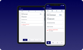
Making Product Discovery Easier and More Accessible
Turn Your Vision into a Reality in Four Weeks with Our Expert-Driven TechBoost Program
See Product Discovery ServicesA/B Testing
In this approach, it is possible to compare two versions of some app features and determine which one has a better impact on the use of the application. It allows the developers to compare features, layouts, or any elements of the designs, viewing the preferences and activities of the users. The use of A/B testing provides a sound basis for decision-making, which in turn means that developers are able to make changes that will be most appreciated by the users, leading to enhanced performance of the app as well as enhanced satisfaction. It also assesses metrics like time spent on a page or bounce rates, which provides more insights to developers.
For example, Netflix is using A/B testing to optimize its call-to-action button and other features, resulting in more sign-ups and higher usability.
Prioritize User Needs
User-Centered Design
Mobile applications must be created with the user in mind and this is the reason why user-centered design is a crucial aspect. This way, designers can pinpoint the major needs and objectives of the user and make sure that the layout and the navigation are smooth and the calls to action are well-defined. This approach entails a detailed analysis of the user requirements to determine what the user wants to accomplish using the app, thus helping to guide the design process to meet the user’s needs and expectations.
Task Analysis
Task analysis builds on a user-centered design by bringing the user context into the app. When and where the user will engage with the application can be considered to design features and workflows that match the actual usage. Simplifying some complex tasks makes systems accessible and reduces the learning curve of app usage while identifying pitfalls preemptively minimizes user errors. Such an approach means that the app is designed to fulfill the users’ expectations and increase the application’s usage in the future.
Performance Optimization
Fast Load Times
The faster the page loads, the more users remain active on the site, and therefore, bounce rates are kept low. It is recommended that a mobile application take three seconds or less to load since users are likely to lose interest and move on to other apps. This quick responsiveness ensures that consumers can use the app’s features without any delay so that they can enjoy the app and use it frequently.
Recommendations
- Minimize HTTP Requests: Reduce the number of requests by combining CSS and JavaScript files, using CSS sprites, and minimizing external resources.
- Compress Images: Optimize images by compressing them without compromising quality. Use modern image formats like WebP.
- Browser Caching: Leverage browser caching to store static assets locally, reducing subsequent load times.
- Content Delivery Networks (CDNs): Use CDNs to distribute content across multiple servers, improving load times globally.
- Lazy Loading: Load only visible content initially and defer loading of non-critical elements until needed.
- Asynchronous Loading: Load scripts asynchronously to prevent blocking page rendering.
- Minimize Redirects: Avoid unnecessary redirects, which add latency.
- Optimize Server Response Time: Optimize server-side code and database queries.
- Use a Content Delivery Network (CDN): CDNs distribute content across multiple servers, reducing latency.
- Monitor Performance: Regularly analyze load times using tools like Google PageSpeed Insights or Lighthouse.
Optimize Images and Code
It is crucial to reduce the size of images and optimize the code used in apps. This is because images can be compressed, and by writing clean code, the amount of loading time and overall resource usage of the app can be greatly minimized. Data, offloading, and the use of lightweight code structures add to the smooth and efficient nature of the application, making sure that the user remains happy and content with the performance of the application.
Recommendations
Image Optimization
- Choose the Right Format: Use WebP, JPEG 2000, or JPEG XR for images. They offer better compression and quality.
- Resize Images: Serve images at the required dimensions to avoid unnecessary data transfer.
- Compress Images: Use tools like ImageOptim or TinyPNG to compress images.
- Responsive Images: Implement responsive images using srcset attributes.
Code Optimization
- Minify CSS and JavaScript: Remove unnecessary whitespace, comments, and unused code.
- Gzip Compression: Enable Gzip compression on the server to reduce file sizes.
- Avoid Render-Blocking Resources: Load critical CSS inline or asynchronously.
- Use Browser Caching: Set appropriate cache headers for static assets.
- Optimize Fonts: Use font subsets and load only necessary font weights.
- Reduce Third-Party Scripts: Limit third-party scripts to essential ones.
- Code Splitting: Split large JavaScript files into smaller chunks.
- Tree Shaking: Remove unused code from JavaScript bundles.
Security and Privacy
Data Protection
It is evident that data protection plays a crucial role in mobile apps’ development, and for this reason, security and privacy policies are essential to protect user data. Encryption, secure authentication methods, and data anonymization are the measures that developers must employ in order to safeguard users’ information leakage. Being compliant with the requirements of GDPR or CCPA not only enhances the customers’ trust but also prevents legal consequences, which is very important for guaranteeing a secure usage experience.
Consider to take into consideration the following:
- Privacy Policies and Consent:
- Create clear and concise privacy policies that inform users about data collection, storage, and usage.
- Obtain explicit consent before collecting personal data.
- Encryption:
- Use strong encryption (e.g., TLS/SSL) to protect data during transmission.
- Encrypt sensitive data at rest (e.g., in databases) using encryption algorithms.
- Access Controls:
- Implement role-based access controls (RBAC) to limit data access to authorized personnel.
- Regularly review and revoke unnecessary access privileges.
- Secure Authentication:
- Use multi-factor authentication (MFA) to enhance login security.
- Avoid storing plaintext passwords; hash and salt them.
- Data Minimization:
- Collect only necessary data; avoid over-collection. o
- Anonymize or pseudonymize data where possible.
- Regular Audits and Monitoring:
- Conduct security audits to identify vulnerabilities.
- Monitor logs for suspicious activity.
- Compliance with Regulations:
- Understand and adhere to data protection laws (e.g., GDPR, CCPA).
- Appoint a Data Protection Officer (DPO) if required.
- Incident Response Plan:
- Prepare for data breaches with an incident response plan.
- Notify affected users promptly if a breach occurs.
Personalization
User Control
Enabling users to manage aspects of the app is key to improving their satisfaction levels and overall engagement. Let users manage their experience by helping them turn notifications on or off or change the app’s look by choosing themes. Also, enable the option to control data sharing and privacy settings. This flexibility addresses personal needs and creates a sense of belonging and familiarity, which increases the likelihood of app usage regularly.
Contextual Relevance
The use of contextual information lies in timely, personalized, and valuable notifications to users based on their interests and usage patterns. In this regard, the collection of information about the user and his behavior allows the application to provide content and alerts relevant to the context of use. Such as nearby events and offers or sending out a notification for completing a task or reaching a milestone. This way, the notifications do not negatively interfere with the user’s app experience; rather, they are reminders that may be useful to the users.
Seamless Experience Across Devices
Cross-Platform Consistency
A user should get a similar experience when using a mobile app, a mobile website, or a standard website to ensure that the user and the brand are aligned. Maintaining consistency across platforms is about replicating design features, interfaces, and the overall interaction experience to make them seamless. The continuity of branding and designing on the different devices increases the level of familiarity and trust among the users across the different devices, be it the smartphone, tablet, or computer. This uniformity not only enhances the brand identity and recognition of the app but also improves the usability aspect of the app as well.
Elevate Your Mobile App Experience
Developing a better mobile application means incorporating a set of qualitative and quantitative aspects in terms of usability, velocity, accessibility, and individuality. By following these best practices, developers can ensure that their apps are easy to use, performant, and interesting for users, leading to their satisfaction and further usage of the developed app. In essence, it is crucial to involve experts in this field for any business interested in developing new applications or enhancing existing ones.
HyperSense Software’s operating principle focuses on providing unique solutions based on your demands. Let’s discuss and identify how we can support you in enhancing the performance of your mobile application.
IT Consultancy Designed Around Your Business Objectives
Expert Guidance to Optimize Your Technology Strategy
Discover IT Consulting