Today, the internet is a necessity: it is impossible to imagine life without this invention. Whether we are making purchases, reading news, or accessing services, websites and web applications meet our informational and service needs in one way or another. However, not all people can be present in these digital contexts. This is where the Web Content Accessibility Guidelines, least known as WCAG, will fit in.
WCAG 2.2 became a list of web accessibility rules and a statement of willingness to make the internet accessible to everyone—with or without disabilities. For organizations planning to design or redesign their online presence, knowledge of WCAG 2.2 is essential for complying with compliance requirements, ensuring the extent of coverage, and optimizing users’ experience.
This article will delve into the specifics of WCAG 2.2, explaining its importance, the new success criteria, and how it impacts web development.
Invest in Professional UX/UI Design to Create Impactful Interfaces
Designing Seamless User Journeys That Boost Interaction and Conversion Rates
Discover UI/UX DesignWhat is WCAG?
WCAG is the acronym for Web Content Accessibility Guidelines, created by the World Wide Web Consortium (W3C). Web content accessibility guidelines define specific instructional requirements that help ensure that material on the World Wide Web can be easily accessed by disabled persons with particular sensitivities to vision, hearing, learning, and physical dexterity. For the last 15 years, WCAG has been regularly revised to correspond to the new technologies and changing user requirements since its first release in 1999.
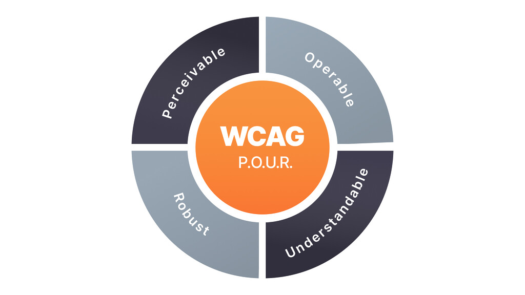
WCAG 2.2 revised, which is referred to as WCAG 2, builds up on the former, in our case, WCAG 2.1, by including new success criteria that were meant to tackle issues of accessibility for the disabled user. The guidelines are organized around the four core principles governing web accessibility: Perceivable, Operable, Understandable, and Robust (POUR). Every principle is expanded to guidelines and success criteria, which explain how Web content accessibility can be improved.
Why WCAG 2. 2 Matters?
Compliance with WCAG 2. 2 is about being safe from legal troubles and building an inclusive web. Data obtained from WHO (World Health Organization) show that over one billion people, or an estimated 16 percent of the global population, have a disability of some type. Ensuring that your website or application is easily accessible for everybody to use is beneficial. In most cases, such sites rank highly on search engines, and their interface is more engaging to users, resulting in better click-through and conversion rates.
Published as a W3C recommendation on October 5, 2023, WCAG 2.2 introduces nine new success criteria, enhancing the guidelines to better serve a broader range of users.
WCAG Levels of Compliance
The Web Content Accessibility Guidelines (WCAG) are organized into three levels of compliance to address varying degrees of web accessibility.
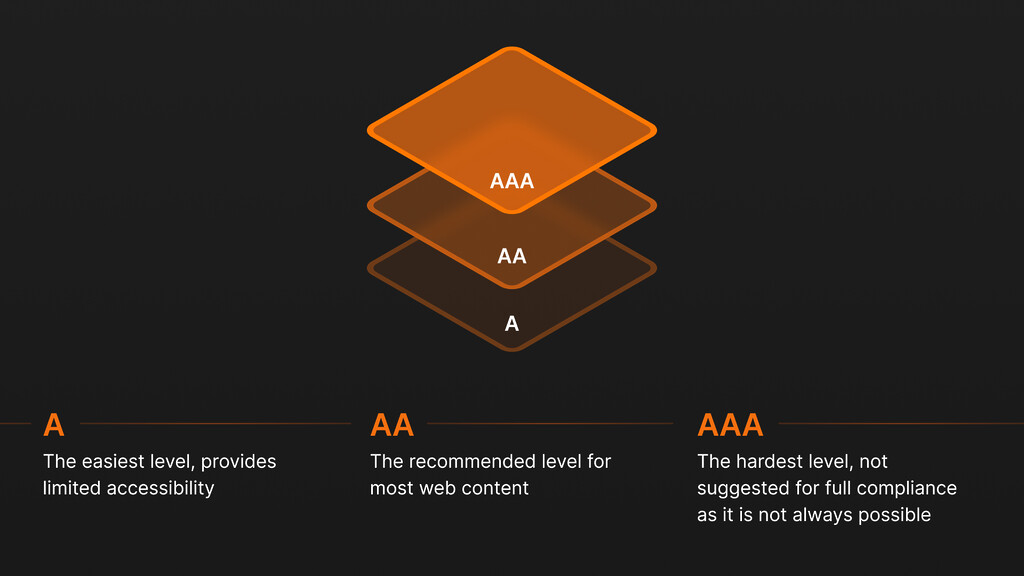
Level A is the most basic level, requiring websites to meet minimum accessibility standards. These guidelines focus on essential functions, such as making sure content is usable with a keyboard or that text alternatives are provided for non-text content (like images).
Level AA is the intermediate level, addressing a broader range of accessibility barriers. This level covers important features like providing sufficient contrast between text and background colors and ensuring navigational elements are consistent across the website.
Level AAA represents the highest level of accessibility, which is the most comprehensive and often the most challenging to implement. It includes more advanced requirements, such as providing alternative sign language interpretations for video content or ensuring no content flashes more than three times in one second to prevent seizures.
While Level AA is commonly the goal for most organizations to meet legal requirements, striving for AAA enhances inclusivity even further, ensuring the best possible experience for all users.
Importance and Impact of WCAG 2.2
Some of the improvements made in WCAG 2.2 are critical to meeting the changing demands of web technologies and the multiple aspects needed by developing different platforms. The 2.2 version mainly addresses areas that include cognitive access, mobile access, and low-vision access to gadgets and the web by enhancing the accessibility of web content to the broader community of users. In contrast to previous versions, this version of the guidelines has additional criteria to make more detailed recommendations for assisting a wider spectrum of disabilities, including vision, hearing, mobility, speech, communication, processing, and learning impairments, as well as neurological disorders.
For businesses and website developers, it becomes important to understand these guidelines and apply them to make websites accessible to all persons with different abilities. Furthermore, in many places, following such guidelines is mandatory by law, and going against them will attract the law. Therefore, incorporating WCAG 2. 2 To hold conventions into web development practices is not just about adhering to rules but acknowledging the need to become involved in making content accessible for everyone.
Benefits for Businesses Implementing WCAG 2.2
Legal Compliance
Several statutes demand web accessibility worldwide, including the Americans with Disabilities Act (ADA) in the United States and the European Accessibility Act in the European Union. Hence, if organizations follow the principles set out in WCAG 2.2, businesses can ensure that they do not infringe on these laws, attract litigation, or be penalized for the law. Apart from putting the company in a safe, legal zone, compliance shows that the company considers the general society as it is socially responsible.
Improved User Experience
It can be said that when the website is accessible, everyone benefits, and it is an excellent opportunity for people with disabilities. Elements such as navigation bars, font, and keyboard accommodation make it easy for all people with or without disabilities to use the site. This can drive up the overall satisfaction levels of the users, increase the amount of time spent on site, and increase overall interaction. This is because if users encounter little difficulties in using a website, they will be encouraged to return to the website and introduce others to the site, increasing its traffic and business potential.
Expanded Audience
If you make your website accessible, you can expand its functionality for a greatly expanded population: people with disabilities, older people, and users of portable electronic devices. As mentioned before, the WHO predicts that of the global population, 16% of them, or about 1 billion people have a disability. Also, it is evident that as the population of the world grows older, the number of people with age-related disabilities is also rising. What it means that your website is accessible means you are not excluding such a large potential audience, hence customers.
Enhanced Reputation
Ensuring that your brand has principles that reflect the values of accessibility can only accentuate your brand’s credibility. This component highlights that your company supports equal opportunities for all people, which can be considered a selling point for customers, business associates, and employees. An emphasis on customer access can be one of the brand’s key assets with a high competitive advantage, and therefore, it promotes user loyalty. More so, it may appeal to other customers with a socially responsible buying attitude towards products from business entities that value ethical standards.
Main Principles of Accessibility in WCAG 2.2
The Web Content Accessibility Guidelines (WCAG) 2.2 are based on four stable categories, which are crucial for providing users, including disabled ones, with an opportunity to use web content. These principles are captured by the acronym POUR: Perceivable, Operable, Understandable, and Robust. Combined, they present a guideline that web developers and designers can adopt to ensure their content is accessible to all.
Perceivable Principle in WCAG 2.2
The principle used in this context is Perceivable, which ensures the user can understand all information displayed on the webpage. This means that content should be created in forms that engage one or more of the user’s senses.
Text Alternatives
Text descriptions are again required to navigate non-text content. For instance, images must have alt tags, videos must have closed captions, and audio must have transcripts. These text alternatives enable the blind and visually impaired or those who cannot process visual or audio information in any way to access the content with the help of screen readers or braille displays.
Time-based Media
Users who cannot play audio or video files must be shown alternatives. This pertains to the video description, where captions are provided for the video and the transcript for the audio content, especially when it is difficult for one with a hearing disability to comprehend. It also helps users who may find themselves in places where they cannot make noise, for instance, at the office or while on a train.
Adaptable
Web content should be reusable because it can be presented in multiple forms without altering or modifying the content or format of the actual content. This feature is especially important for users who may want to tweak their browsing environment by enlarging text fonts, using low graphics design, or even setting the specific style sheets necessary to simplify their view on the website. Usability makes it possible for the content to be easily understandable from whichever angle it is viewed.
Distinguishable
Making content distinguishable ensures the user can visually and audibly notice the content. This includes features like proper contrast between the text and the background, which may be very important for users who have poor eyesight or are color-blind. Also, the content should not depend on color to convey information since this can lock out persons with color blindness. However, other graphical or textual cues should be employed to benefit all website users, especially the physically challenged.
Operable Principle in WCAG 2.2
The Operable principle of WCAG 2. 2 guarantees that all the components of the user interface and the navigation items are accessible to all users, including those with disabilities. This implies that a user should be able to operate on each control and access content with perceived ease. In an operable web context, it is always possible that users will access a piece of content in several ways, so it will need to be available to all, regardless of any disabilities the user may have or the equipment they are using.
Keyboard Accessible
The operable principle requires that all functionality be operable through the keyboard. This is particularly crucial for users with disabilities who cannot use a mouse or for those using a screen reader. Keyboard operability is the concept whereby users should be able to get around, operate all controls, and accomplish all tasks on the site using only a keyboard. This includes keyboard navigation, such as using ‘Tab’ to interact with clickable interfaces and ‘Enter’ or ‘Space’ to select.
Enough Time
Filters set for a particular website must allow enough time for users to read the content or participate in activities. Some individuals, such as those with cognitive impairment, may need additional time to comprehend information or perform tasks. Hence, accommodating customizable time settings that allow pausing, stopping, or hiding moving, blinking, or scrolling components is crucial. This feature allows all users to interact with the content at their preferred pace without other people’s pace rushing them.
Seizures and Physical Reactions
To protect each surfer, information that may trigger seizures or cause physical responses should not be posted online. Any content that flashes or flickers can cause seizures if the flicker rate is more than three times per second, especially in the case of photosensitive epilepsy. Likewise, particular content that blinks or scrolls quickly can elicit discomfort or physical symptoms in some users. Therefore, web developers can build a safer, more inclusive environment by inhibiting such elements or offering disabling mechanisms.
Navigable
Navigation is essential, particularly when locating an area within a website and searching for specific content. This includes staying consistent with the navigation tools; this way, at a certain point, the user can learn where specific components are located on the page by finding them in the same place on all the other pages. Clear headings and labels make it easier for users to locate the information they seek and to determine the layout of the webpage. Other effective navigation tools include the use of breadcrumbs, search, and site maps, which are necessary facets of any website.
Input Modalities
The shift that started from the keyboard and mouse way of interacting with content has expanded to touch, stylus, voice, and eye-tracking devices. It is essential to ensure functionality is always available through the different input methods mentioned above. This means developing web controls usable through touch on smartphones and tablets, voice on smart speakers, and other accessibility tools. This means that by accepting several input methods simultaneously, websites become more usable for people with different preferences and limitations, including those with physical or cognitive disabilities regarding input device operations.
Understandable Principle in WCAG 2.2
This WCAG 2.2 Principle guarantees that everybody comprehends what is on the presented page, including the operation of the user interface. This principle is concerned with establishing clear communication and a logical flow of information processing so that users can quickly and easily understand the content and its usability. Ease of use web design enhances the experience for any user with a disability, low literacy levels, or little understanding of the common website layout.
Readable
It broadly encompasses enabling the text content to be easily readable and understandable. This entails avoiding using technical terms when making write-ups for the community or different subjects within the community. For the general audience, it may be advisable not to use complex language requiring specialized knowledge to understand what is being communicated. Also, dividing content logically into sections with short paragraphs, bullet points, and headings can help the user read and understand the information provided. For persons with learning disabilities or low levels of formal education, having summaries of the textual content or additional illustrations can also be helpful to a great extent.
Predictable
An interface should provide a sense of predictability, allowing users to work through it efficiently when using a website. When the web pages are presented and function in such a manner, users feel more at ease and have more control. This implies that the navigation features should be consistent throughout the website and that the stimuli on the page should operate as expected. For instance, a ‘submit’ button should always submit a form, while links should show whether they will open a new window or tab. This way, confusion and frustration are avoided, especially in cases of users with cognitive disabilities or new to the given website. It also works towards establishing credibility and dependability of the website usage among its users.
Input Assistance
It is critical to help users avoid and correct errors, including figuring out how to make the content on the website less confusing. This encompasses giving guidelines about the form fields and other widgets so that a user knows what is expected to be filled in and in what format. In cases where users make mistakes, providing prompt error messages can assist the users in correcting whatever they entered appropriately. For example, if a user enters an erroneous email format, a complete message should be provided to the user about a valid email format. Affordances like carefully labeling controls or using double asking questions (like ‘Are you sure you wish to delete this item?’) further enhance the prevention of errors that may cause user frustration or a result of a simple mistake.
Robust Principle of WCAG 2.2
The Robust principle of WCAG 2. 2 underlines the idea that web content must be sufficiently malleable and durable to ensure that it can be correctly interpreted by a wide range of user agents, including browsers and assistive technologies. This principle ensures that when the technologies and user agents change, the content will still be accessible to disabled people and others who use the specific tools to access the web content. Adhering to the Robust principle, developers can ensure that their sites will always be reachable when new technologies appear or when existing ones are given a new update.
Compatible
The Robust principle also embraces adequate catering for compatibility with current and future user agents. This means employing HTML and ARIA (Accessible Rich Internet Applications) attributes that are well-recognized by current browsers and screen readers. According to these standards, web developers can ensure their content is read correctly by screen reading tools, magnifiers, voice input applications, and all other assistive devices. This compatibility is essential to ensure that the end-users with disabilities, who rely on such technologies to access website contents, have a smooth and streamlined interaction.
Valid Code
Using valid, semantic HTML is essential to ensure web content is correctly parsed and displayed by browsers and assistive technologies. Semantic HTML makes the web more meaningful for assistive technologies by enabling the output of relationships between different components and the contribution of contexts. For instance, applying <header>, <nav>, <main>, and <footer> tags improves the web page’s accessibility for the screen reader. It allows developers to govern what the end product looks like and, by extension, the physical and electronic barriers that come with bad coding practices. It gives access to all persons using tools such as screen readers, text-to-speech applications, and the like.
Assistive Technology Support
Obviously, for robust accessibility, content needs to work with multiple different levels of assistive technologies. This includes testing with screen reader tools like JAWS, NVDA, voice recognition software, and other assistive devices to detect compatibility problems. Thus, testing under different platforms and devices will help developers gain insights into how all classes of users, based on their technological disposition, will be able to utilize this content. Another aspect of accessibility that the web content should support is the spectrum of Assistive Technologies being used, as it bridges the gap and makes access to web content possible for people using various types of equipment due to their disabilities.
Key Changes in WCAG 2.2
The WCAG 2.2 update adds nine new success criteria while eliminating one, thus having 86 success criteria aimed at improving web accessibility. Such changes are aimed at meeting the evolving needs of users with disabilities and the development of web technologies, ensuring that web content remains inclusive and accessible to all. Here are the most significant additions in WCAG 2.2:
Focus Not Obscured (Minimum) (2.4.11, Level AA)
This criterion ensures that other content does not obscure the focus indicators when users move through interactive elements with a keyboard. This is especially important for keyboard-only users, such as users with motor diseases, who also need to see which interface element is currently active. In this way, users can easily navigate the web content, and focus indicators will always remind them of their location within the website.
Focus Not Obscured (Enhanced) (2.4.12, Level AAA
This enhanced criterion guarantees that any time a user interface component acquires keyboard focus, nothing on the element is obscured by author-authored content. This, therefore, means that all features of the focused component must be fully viewable, even if there are other features, such as overlapping content or other dynamic objects. This ensures that users can always view and engage with focused elements without interference, which is especially beneficial for keyboard users.
Focus Appearance (2.4.13, Level AAA)
This success criterion requires the focus indicators placed on the interactive elements to be a specific size and contrasting. The objective is to clearly distinguish the focus state from other content on the given webpage based on keyboard navigation. This is especially true for people with low vision or cognitive disabilities who might barely notice changes in focus.
Dragging Movements (2.5.7, Level AA)
This criterion gives other ways of dragging actions apart from using the pointing device, which is difficult for motor disabilities. For instance, instead of leaving a user to drag elements using the mouse or a touchpad, a website should provide other means to accomplish the same action, such as using the arrow keys on the keyboard or having pop-up boxes from which a user checks a particular item. This change means that every user can use the website content no matter the level of disabilities they may have.
Target Size (Minimum) (2.5.8, Level AA)
This success criterion ensures that anything with an interaction factor, for instance, buttons and links, occupies at least 24×24 CSS pixels. By extending the target size, users with motor difficulties or touchscreen devices will be able to click on the desirable targets without clicking on the wrong targets. More significant goals contribute to the decrease of errors and enhancement of the general accessibility of web interfaces for all the subjects.
Consistent Help (3.2.6, Level A)
Primarily to increase user interface consistency, this criterion demands that help facilities, including buttons or links to support, be positioned in various areas. This creates continuity to make it easier for a user to look for help in case they have a cognitive disability or in cases where they are not conversant with the website, enabling them to use it on their own.
Redundant Entry (3.3.7, Level A)
This criterion is amongst the objectives to avoid the user inputting the same information several times as the user goes through a process. By reducing redundancy, websites can minimize frustration and cognitive load for users, particularly those with memory impairments or cognitive disabilities. It makes sure that if a user, for example, has typed their name or address, it remains recorded even if different parts of the application or website are being used.
Accessible Authentication (Minimum) (3.3.8, Level AA)
This success criterion cautions that technologies chosen for remote working do not incorporate methods involving memory, transcription, or cognitive tests. For instance, websites should offer different ways of logging in, such as biometric login, magic links sent to the user’s email, or security questions that involve the user giving answers that are not passwords. By designing this approach, it becomes simple for people with disabilities, especially in the cognitive aspect, to secure this content.
Accessible Authentication (Enhanced) (3.3.9, Level AAA)
If you build on these basic requirements, this criterion permits password managers and the copying and pasting of credentials. To host these tools, websites ensure that users with all levels of disability, such as cognitive and motor disability, are easily authenticated without needing to recall passwords or do a lot of typing. Being able to accommodate these lowered barriers to the secure area increases the usage of your website and users’ retention.
Removed success criterion 4.1.1 Parsing
Parsing, in particular, was devoted to making sure that content was parsed correctly by agents, particularly user agents such as web browsers. This change reflects the maturity of web development standards. Because of current innovations in web development formats, current web browsers, and more precisely, web page parsers, are more developed to handle such parsing errors without necessarily affecting accessibility.
Best Practices for Implementing WCAG 2.2
Ensuring the usability of the W3C software and applying the Web Content Accessibility Guidelines (WCAG) 2. 2 needs comprehension of new success factors and willingness to implement these standards throughout the web development work. Here are some best practices to ensure your web content meets the latest accessibility standards:
Digital Transformation for Competitive Advantage
Empowering Your Business with Tailored Digital Solutions
Explore Digital TransformationConduct Accessibility Audits
Performing an accessibility review often helps detect possible pitfalls that make it difficult for disabled persons to use the material. To capture all the requirements, audits should include both automated and manual types.
Automated Testing Tools
For example, Axe, WAVE, and Lighthouse tools point out fundamental problems with accessibility, such as missing alt text, lack of enough contrast ratio, and misuse of ARIA roles and attributes. These tools are certainly helpful when it comes to searching for mistakes that might be hardly noticed in manual examinations and can, at the same time, give preliminary suggestions for accessibility amendments.
Manual Testing
While automated tools may help you find some problems, they will never be enough to make your site fully accessible. More often, getting users with disabilities to go through your content physically will give you an idea of how actual site users will interact. Examples of such issues include issues with navigation flows or content structure that may not be apparent when using an automated tool. However, an intended user can detect, say, if they use a screen reader, keyboard navigation, or any other assistive technologies.
Integrate Accessibility into Your Workflow
Web accessibility means considering whether particular designs will be accessible, and then it needs to be incorporated into everything you do. This way, required accessibility is first incorporated into projects’ designs instead of being addressed as an addition after the main body is developed.
Design Phase
First and foremost, check whether all the design elements meet the requirements of web accessibility. This comprises providing adequate text and background contrast and proper font sizes in buttons and other interactive tools. If these considerations are incorporated right from the very beginning, they can avoid some expensive and exhaustive redesigns much later.
Development Phase
While designing, one should adhere to practices such as Semantic HTML and ARIA (Accessible Rich Internet Applications) standards. Semantic HTML offers an improved and descriptive structure to web content, making it easier for assistive technology to make sense of the content. ARIA roles and properties can also help make certain complex user interface sections or items more accessible by providing extra information to the user.
Custom Software Development for a Competitive Edge
Build Unique Software Solutions with Our Expertise
Explore Custom SoftwareContent Creation
Ensure all elements that are not text-based, i.e., images and videos, are adequately described. Employ the use of understandable fonts, keeping in mind forget and avoid the use of long sentences that may be burdensome for users who rely more on the browser’s graphical user interface and use of headings to help the user navigate easily, especially blind users of the browsers.
Provide Training and Resources
Before creating web content, it is necessary to train your team regarding WCAG 2. 2 and accessibility guidelines so that everyone involved knows accessibility and how to achieve it.
Training Programs
Organize frequent training sessions for website designers, developers, and content creators. These sessions may include a briefing on the principles of WCAG 2.2, the level of compliance with accessibility standards, and the application of accessible methods, tools, and technologies.
Documentation
Ensure that there is a documented record of the accessibility standards and measures taken at a given time for the team members’ reference. This might include procedural requirements for creating accessible content, coding standards, and lists of considerations when checking and inspecting accessible web pages.
Accessories and Tool/Technology Accessibility
The selection of relevant tools and technologies can undoubtedly heavily influence the creation of accessible web content.
Content Management Systems (CMS)
Choose CMS platforms with features to enhance accessibility. These include adding alt tags to images, supporting keyboard navigation, and having templates that are universally accessible. This makes it easier to maintain accessibility when new content is developed and added.
Third-Party Tools
Do not use any third-party tools or plugins that are not accessible to people with disabilities. Ensure these tools comply with accessibility standards and do not worsen users’ experiences.
Plan for Continuous Improvement
Accessibility is not a one-off job but a recurring process that needs regular review and change to maintain compliance.
Regular Updates
Run accessibility checks as part of the regular update schedule to identify new barriers that may appear as the content changes or new functionality is developed. This way, minor problems do not accumulate, and accessibility remains high throughout the organization.
Also, ensure you incorporate any updates that might appear in the regulation. You might change some design aspects, alter code, or reorganize content to meet the WCAG 2.2 standards. Therefore, accessibility features should be addressed in every development phase to prevent future litigation.
User Feedback
Gather data on user concerns and disability experiences and employ this data to make improvements. This makes it easier to make decisions about improving accessibility because you are directly interacting with the target users.
Document and Report Compliance
It is crucial to keep detailed records of your accessibility work to prove compliance with WCAG 2.2 requirements and learn the strengths and weaknesses that are most effective for intervention.
Accessibility Statements
Place an updated Accessibility Statement on a website as part of your commitment to WCAG 2.2 compliance. This will not only inform users about your commitment to accessibility but also give them details on how to report cases of inaccessibility.
Compliance Reports
Schedule and routinely produce reports about your accessibility and the measures being taken. These reports can help monitor progress made regarding accessibility, recognize that there are still difficulties present, and continue to strive toward the goal of accessible websites.
Following these best practices, it is possible to adequately meet the requirements set by WCAG 2. 2 and design technology interfaces that are accessible to as many communities as possible. The key measures to creating an accessible website are adapting to the new standards for success, performing routine evaluations, including accessibility into the work process, offering instructions, employing accessible equipment, developing a long-term strategy for improvement, and recording the results.
Experience Expert IT Consultancy
Transformative Strategies for Your Technology Needs
Discover IT ConsultingWhat is next in the WCAG Framework?
WCAG 2.2 is anticipated to be the final update in the WCAG 2.x series before the introduction of WCAG 3.0, which is currently being developed under the codename “Silver.” This upcoming version aims to provide a more flexible and comprehensive framework for web accessibility, accommodating the rapid evolution of web technologies and diverse user needs. As the digital landscape changes, staying informed about the latest accessibility standards and best practices will be essential for organizations committed to creating inclusive digital experiences.
In conclusion, WCAG 2.2 has introduced more comprehensive and elaborate guidelines that help to make website content and other internet-based materials and services more open to people of all types of disabilities. Through adopting these new standards, web developers and content creators will be able to help create an inclusive environment, thus enabling people with disabilities to benefit from new technological advancements. As we anticipate for WCAG 3.0, it is essential to maintain this emphasis on accessibility as they bring in new technologies, and the users’ needs will continue to grow.Let’s discuss how we can help you enable your website to provide an inclusive digital experience for all users worldwide.
What are the Web Content Accessibility Guidelines (WCAG) 2.2?
WCAG 2.2 provides guidelines that web designers and developers must follow to ensure that web content is accessible to people with disabilities, including those with cognitive, learning, and mobility impairments and low-vision users. It builds upon WCAG 2.0 and 2.1, adding nine new success criteria to enhance accessibility.
When was WCAG 2.2 released?
WCAG 2.2 was officially released as a W3C Recommendation on October 5, 2023.
What is the timeline for the adoption of WCAG 2.2?
While WCAG 2.2 is now the latest standard, it may take some time to be widely adopted or referenced in legislation. For example, the UK’s Public Sector Bodies Accessibility Regulations (PSBAR) will require conformance with WCAG 2.2 starting October 2024. Organizations should stay informed about relevant regional timelines and prepare to meet the new standards before regulatory deadlines.
Why should organizations comply with WCAG 2.2?
Compliance with WCAG 2.2 is essential because it helps ensure digital content is accessible to all users, including those with disabilities. This meets legal requirements in many jurisdictions, expands market reach, and improves the user experience for a broader audience.
What are the new success criteria in WCAG 2.2?
WCAG 2.2 introduces nine new success criteria, including:
- Focus Appearance (2.4.11, Level AA)
- Focus Not Obscured (Minimum) (2.4.12, Level AA)
- Focus Not Obscured (Enhanced) (2.4.13, Level AAA)
- Dragging Movements (2.5.7, Level AA)
- Target Size (Minimum) (2.5.8, Level AA)
- Consistent Help (3.2.6, Level A)
- Redundant Entry (3.3.7, Level A)
- Accessible Authentication (Minimum) (3.3.8, Level AA)
- Accessible Authentication (Enhanced) (3.3.9, Level AAA).
How does WCAG 2.2 impact mobile accessibility?
WCAG 2.2 includes criteria that benefit mobile accessibility, such as ensuring touch targets are adequately sized, providing alternatives to dragging actions, and making focus indicators more visible. These updates help make mobile applications more accessible to users with disabilities.
Is WCAG 2.2 backward compatible with WCAG 2.0 and 2.1?
Yes, WCAG 2.2 is backward compatible with WCAG 2.0 and 2.1. This means that content conforming to WCAG 2.0 or 2.1 will also conform to WCAG 2.2, provided the new success criteria are also met.
How will WCAG 2.2 affect existing accessibility compliance?
Websites and applications that comply with WCAG 2.1 or 2.0 can be updated to meet WCAG 2.2 with relatively minor adjustments. The new success criteria build on the existing framework, so the transition should be smooth for compliant sites.
What are the conformance levels in WCAG 2.2?
WCAG 2.2 maintains the same conformance levels as previous versions:
- Level A: The minimum level of accessibility.
- Level AA: The mid-range level of accessibility, addressing the most common barriers.
- Level AAA: The highest level of accessibility, addressing the broadest range of barriers.
How can I get updates on WCAG 2.2 and future guidelines?
You can subscribe to W3C’s Web Accessibility Initiative (WAI) news to receive updates on WCAG 2.2 and future guidelines. This includes announcements of updated drafts, new releases, and other important information.
Where can I start learning about WCAG 2.2?
To start learning about WCAG 2.2, you can refer to the WCAG Overview provided by W3C. This resource offers a comprehensive introduction to the guidelines and points to several resources for understanding and implementing WCAG 2.2.
What resources are available to help organizations implement WCAG 2.2?
Numerous resources are available to help organizations implement WCAG 2.2, including:
- W3C’s WCAG 2.2 Documentation: Provides detailed explanations of each success criterion, including examples and techniques for implementation. W3C WCAG 2.2
- Online Training and Webinars: Many organizations and experts offer webinars, courses, and workshops on web accessibility and WCAG 2.2 compliance.
- Accessibility Testing Tools: Tools like Axe, WAVE, and Lighthouse can help identify and fix common accessibility issues.
- Screen Readers: Tools like NVDA, JAWS, and VoiceOver can be used to test how well your website works with screen readers.
- Color Contrasted Analyzers: Tools like the Colour Contrast Analyser can help ensure your text meets contrast requirements.
- ConsultingServices: Accessibility experts can provide personalized guidance, training, and audits to help organizations implement WCAG 2.2 effectively.
Can automated tools fully ensure WCAG 2.2 compliance?
Automated tools are valuable for identifying common accessibility issues and providing a quick overview of a website’s accessibility status. However, they cannot fully ensure WCAG 2.2 compliance. Automated tools can miss more nuanced issues, such as content clarity, logical navigation, and specific usability challenges faced by users with disabilities. Therefore, combining automated testing with manual testing, especially by users with disabilities, is essential to achieve comprehensive compliance and ensure a truly accessible user experience.
What should organizations include in their accessibility statement to reflect WCAG 2.2 compliance?
An accessibility statement should communicate the organization’s commitment to accessibility and outline the steps taken to comply with WCAG 2.2. It should include:
- Compliance Status: Information on the level of WCAG 2.2 compliance achieved (e.g., Level A, AA, AAA).
- Accessibility Features: A summary of the key accessibility features implemented on the website or application.
- Areas for Improvement: Any known accessibility issues still being addressed and a timeline for resolution.
- Feedback Mechanism: Contact information or a form for users to report accessibility issues or provide feedback.
- Date of Last Update: The date when the accessibility statement was last reviewed or updated to ensure it reflects the current status.
Who should be involved in implementing WCAG 2.2 in an organization?
Implementing WCAG 2.2 should be a collaborative effort involving multiple stakeholders within an organization, including:
- Designers: To ensure that visual and interactive elements meet accessibility standards. • Developers: To implement code that adheres to WCAG 2.2 guidelines using semantic HTML and ARIA practices.
- Content Creators: To produce text, images, and media that are accessible, providing alternatives and clear, simple language.
- Quality Assurance Teams: To conduct thorough testing and validation to ensure compliance with accessibility standards.
- Project Managers: To oversee the implementation process, coordinate efforts among different teams, and ensure that accessibility is prioritized throughout the project lifecycle.
How does WCAG 2.2 impact SEO?
Many WCAG 2.2 guidelines align with SEO best practices. For example, providing text alternatives for images and ensuring a logical heading structure can improve accessibility and search engine rankings.


