Design principles are basic principles that guide the creation of visually appealing and effective designs. When it comes to software development, these principles are crucial for creating interfaces and experiences that users appreciate. From a minimalistic mobile application to an understandable e-commerce website or powerful enterprise software, knowledge of design principles helps make the software engaging and user-friendly.
Knowledge and effective use of these principles are crucial for designers to create an impactful UX. Whether designing a software interface or a tangible product, the principles of design are the same: They contribute to harmony, simplicity, and functionality.
In this article, you will find insightful information on the fundamental concepts of design and their importance in the software development process.
Balance as a Design Principal
Balance as a layout principle can be described as the evenness of the visual weight in the design. It can be balanced, and the elements of a design mirror each other, or it can be anaphoric, and contrast components are placed for the contrasting effect. Proper balance makes a design feel great and coordinated; it directs the view over a certain composition.
Boost Engagement Through Tailored UX/UI Design
Designing Impactful Digital Experiences That Foster Connection and Increase Sales
Discover UI/UX DesignSymmetrical Balance: Stability and Order
The actual idea of symmetrical balance is where the elements of a design are arranged equally on either side of the central axis, producing a mirrored effect. This type of balance is common in formality and tradition, which is good for the kitschy and the messy. For instance, in a corporate website, the use of symmetrical balance can effectively portray a corporate image of the company and thus be adopted. Another example of applying the principles of design is discussed in the context of the redesign of the IBM website, where the concept of symmetrical balance was incorporated in order to improve the usability of the site. Specifically, the redesign emphasized achieving the design elements’ balance by providing a neat layout with evenly spaced features; this led to improved user interactions by 20% and lower bounce rates by 15%.
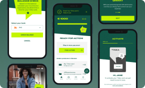
Asymmetrical Balance: Dynamic and Engaging
However, asymmetrical balance employs opposites of size, shape, or color in an object in fashioning special appeal. This type of balance is more active, and the design feels more alive than a static one, though not as rigorous as the previous one. For example, in the redesigning of the Airbnb application, the asymmetrical balance was applied to make the application more colorful and easy to navigate. Positioning more serious pictures beside less significant words and phrases, the design team was able to control the visitors’ attention to the necessary elements and calls to action. They contacted a design agency and decided to redesign the website completely, which resulted in the probability of retaining users increasing three times and the probability of booking a hotel increasing by 25%.
Case Study
Google Material Design is a tool that involves the use of various resources in the creation and development of great designs that can be used in the development of various expensive items. Google has presented this material design as one of the proper ways of applying balance in software design. Layout in Material Design is based on the use of symmetrical and asymmetrical balance as a basis of the cohesive design of the interface. Simplicity and legibility are key in the context of the design language: organizing the page around the grid, supporting animations, and padding serve as the means to balance. A case that involved an examination of Material Design reaction on Google applications demonstrated a positive shift in the preference of its applications by the users as well as enhanced usability rating by as much as 40 % as appreciated by the users.
Contrast as a Design Principal
Contrast is one of the most crucial software design principles that increases the level of curiosity and implements a hierarchy by placing two unlike things close to each other. This principle can be applied to the difference in color or the change in size, shape, and even roughness of the surfaces. If there is something that needs to be seen, proper contrast enables this to occur while at the same time enhancing the feature or characteristic that is intended to be created or enhanced; in addition, the overall readability, which is another aspect of design that is essential in creating items that are easy to use.
Custom Software Development for a Competitive Edge
Build Unique Software Solutions with Our Expertise
Explore Custom SoftwareAchieving Contrast
- Color: Applying opposing colors to each other can really make the elements ‘stand out.’ For example, call-to-action buttons are of a bright color against the monochromatic site background.
- Size: Larger elements obviously attract more attention than components of a smaller size. For instance, a large font on a headline is larger than the regular size of the printed text in the body part.
- Shape: Everything, from the basic shape of an object, contains relevancy that can make an image significantly more interesting. It is possible to observe rather effective usage of circles accompanied by rectangular buttons.
- Texture: You should use different textures to make a design to be more striking since it will be in a different dimension.
Benefits of Contrast
- Visual Interest: The general contrast is quite striking, and it definitely helps make the design much more interesting.
- Hierarchy: It is visually organized to establish a clear structure that helps the user navigate through it logically.
- Readability: Contrast enhances the page’s readability, especially for persons with poor vision.
- Focus: They lead the user’s attention to certain components in a website, for instance, the buttons that indicate a call to action or the details where one is likely to find information.
Case Study
Through contrast, Airbnb maintains a theme for its website to direct the focus on specific details and lead the customers to complete their booking requirements. That is why the site frequently presents good-looking shots of the listings with tags written in stark colors on top. Different font sizes and weights are chosen and arranged effectively in a logical way, which makes the identification of targeted information rather fast.
Insights:
- Color: A series of photographs with clear and barely distinguishable texts on the top and bottom of the pictures.
- Size: Different fonts, different sizes, and even some fonts are bold and some not.
- Focus: Focusing on such vital parameters as prices and availability, such information is readily displayed.
Emphasis as a Design Principal
While exploring noteworthy and appealing descriptions, emphasis was found to be the clear and cogent software design principle. Emphasis in software design is a principle that draws focus to certain aspects of a design that are deemed essential. If size, color, position, or any other graphic design technique is properly utilized, then the targeted information is simply and clearly conveyed.
Achieving Emphasis
- Size: Obviously, it is easier to get attention for those items that are larger in size. For instance, bold font size is applied if the headline versus the smaller body text is to be used.
- Color: Bigger, contrasting colors can overshadow others. As the example above shows, ‘bright or contrasting colors can make elements stand out.’ When you think of it, color contrast is like a red button on a white background.
- Placement: Stating important things like icons, pictures, etc., centrally or at the top of the screen will definitely attract people.
- Other Techniques: It is also possible to emphasize through such properties as font type and size, the use of different forms or scripts, and the existence of animations.
Benefits of Emphasis
- Guides User Attention: Emphasis enhances the user experience because it allows people to distinguish exactly what they have to look for in a shorter time.
- Enhances Readability: Therefore, emphasis adds to the value of the content because it helps in what is referred to as ‘skimming’ or ‘scanning’ of the content.
- Improves Accessibility: Another consideration is that by highlighting, for example, important parts or any part of the knowledge shared, the viewer, including the vision-impaired ones, is able to access the necessary details.
Case Study
Google’s search interface is an example of how goals can be utilized through the principle of emphasis. To optimize its visibility, the search bar is earmarked to be larger than other features and has a different color from the rest of the four features. This design choice instantly captures the user’s focus on the search field, which is the core utility of the page.
Insights:
- Size: The font size of the search bar is bigger than the other objects.
- Placement: Conspicuously located so that they are seen as soon as one enters the place.
- Color: Using contrasting colors to make persons easily distinguish themselves from the background.
Streamlining Your Path to Effective Product Discovery
Make Your Ideas a Reality in Four Weeks with Our Results-Driven TechBoost Program
See Product Discovery ServicesUnity as a Design Principal
It is a principle dictated by simplicity, which is the ability of all parts in the design to have a synergistic relationship. Because of this, you get the impression that everything is in its rightful place, thus achieving the desired order and cohesiveness. Various aspects can be aligned to attain unity, and these include color, typeface, and graphic effects.
Achieving Unity
- Color Consistency: Sticking to a color scheme plays an important role in attaining the material’s coherence. For example, a software application in which the primary actions use shades of blue and successes use green strictly adheres to an effective visual language’s consistency principle.
- Typography: Font choices and text styles should be consistent. For instance, when all the text elements, such as headings, subheadings, and main texts, are in the same font family, it will easily be seen that they belong to the same group.
- Visual Effects: Concerning the similarity of conveying visual effects, including the shadow effect, gradient effect, or animation, will unify separate elements. This way, the user can distinguish the dependency between the various parts of the interface.
Case Study
The general appearance of each Airbnb listing shows how the firm supports unity because its website has a neat look and a similar layout. It is evident that the restrictions in the number of colors, the typeface, and the general visual effects provide a whole effect. The choice of materials is also appropriate since all the design elements are basically neat and appropriately separated, enhancing the layout.
Insights:
- Color: Official colors are used with less intensity to represent the brand identity and have a traditionally appealing, consistent look.
- Typography: Frequently, the consistency of the font on various parts of the platform guarantees readability and uniformity.
- Visual Effects: Real colors are used to create smooth and fine movements to make the operations look good and not clutter the site.
Proportion as a Design Principal
In software design, proportion may be defined as the ratios in scales of size and proportion of different elements in a design. It is especially significant in the area of organization and direction of the viewer’s visual attention to necessary data. Proportionate designs create the appropriate sense of symmetry and are considered to be visually appealing to the users.
Achieving Proportion
- Size and Scale: Proportion refers to the relative size of the objects, with concern being shown to the sizes of parts in comparison to the size of the whole object. Big-received items will stand out more, and smaller items will not be as prominent as larger items of the same size. This is useful in establishing a visual precedence.
- Visual Harmony: Proportion means that all the parts have the same scale. Thus, all the elements are compatible with one another. Such balance makes the surface of the design comfortable for the eyes and enjoyable to interact with.
- Guiding the Viewer’s Eye: Using this technique of size, a designer can control and inform the user of where to go and what is important. For instance, the effects will be that one will get a large button that is more likely to lure the target audience than small prints that are usually placed in texts.
Case Study
Another real-life example is found on Apple’s webpage. The design is basic, and it uses large images to help the target consumers focus on their products. The font used in the text is also smaller to give the visual aspects of the text a greater percentage of the whole page.
Insights:
- Size and Scale: The large pictures of the products quickly grab the attention of the person using the site or the app, while the texts in the small fonts offer the relevant information that the user may need without cluttering the page.
- Visual Harmony: Thus, the layout has been well controlled, with small white spaces and well-proportioned images and texts enhancing its elegance.
- Guiding the Viewer’s Eye: The large size and visibility of the product images help to direct the potential buyer’s eye directly to the spot that reflects all the key information.
Movement as a Design Principal
In software design, movement is the path that the viewer’s eye takes through the design. It may be made by lines, forms, or the distribution of components. Well-executed movement aids the viewer in the logical journey through the content and thereby contributes positively to the usability of the website or application.
Achieving Movement
- Lines: They can cause the viewer’s eye to follow a certain flow in the picture if we create a line. For instance, diagonal lines can make the perceived motion from one object to another and guide the observer’s eye to the subsequent component.
- Shapes: Relation is given meaning, and when shapes are arranged, they help achieve motion. For instance, if connected elements are aligned, they can consist of a series of increasingly larger circles to direct the concern’s attention to the largest circle, which might contain the most significant information.
- Element Arrangement: Certain elements can be strategically arranged, which helps one get a feel for traffic patterns. For instance, when a design contains elements that interconnect, like a zigzag pattern, it means that the viewer’s attention will follow the pattern in a specific way.
Case Study
As previously mentioned, movement within Instagram is a great way to structure the flow of getting the audience through its content. The application’s primary navigation is developed to promote discrete horizontal swipes to move from post to post, with vertical movement between separate posts.
Insights
- Lines: The scrolling feed creates vertical lines on the phone screen, leading the viewer’s eye downwards.
- Shapes: The use of square images ensures a natural and easily traceable rhythm in the flow of images and their spatial arrangement.
- Element Arrangement: The stories’ position at the top of the feed tends to cause users to begin scrolling from that point and go down to the post section.
White Space as a Design Principal
White space, like negative space, is open space in a design. It is very useful for forming the space between elements and avoiding the sensation of overcrowdedness. Thus, the correct utilization of white space enhances the site’s effectiveness and relieves the audience’s attention from the required data.
Achieving Effective Use of White Space
- Creating Breathing Room: White space gives needed spaces between the aspects, which makes a component individually noticeable without congesting the view. This relative freedom lowers the concept’s aggressiveness and digitization’s apparent complexity — and with it, the resulting legibility becomes less daunting.
- Preventing Visual Clutter: This area of space can be used effectively to incorporate the absence of too much information, thus minimizing the overcrowding of the interface. It assists in creating a clean and appealing environment, hence improving users’ usage.
- Improving Readability: Blank space around the text or any other item helps to reduce the clutter in the mind. It allows the viewer to implement the effects without considering the rest of the screen.
- Focusing Attention: White spaces can also be employed to bring focus to some of the sections. After eliminating other elements that can overshadow specific objects, designers can emphasize some of them with negative margins.
Case Study
Apple’s website provides a luxurious feel through the use of white space. Most brands avoid putting the product images and text directly adjacent to one another because if the text and the images are touching, the eyes will focus on that area, bringing white space around the image. The text makes Lay’s website look attractive.
Insights:
- Breathing Room: The space separating the product images is generous and gives the necessary focus on the object, making the site look very luxurious.
- Preventing Clutter: The effective application of white space eliminates the feeling of overpopulation of the interface while maintaining a clean and strict appearance.
- Focusing Attention: Apple has also mastered the use of white space around products, which draws customers’ attention to specific features and details.
Hierarchy as a Design Principal
Visual hierarchy is a fundamental principle in software design that organizes elements based on their importance. It guides the viewer’s eye through the design in a specific order, ensuring that the most critical information is noticed first. This principle helps structure complex information, making it easier for users to navigate and understand the content.
Key Principels of Visual Hierachy
- Size and Scale: Of course, when you compare two elements, it is easier for the viewer to focus on a larger one. For example, the distinct size of the headlines as compared to body text is used to reflect their status.
- Color and Contrast: The use of light or contrasting colors also highlights certain aspects that are worthy of notice. For instance, the call-to-action button is usually a bright color different from the rest of the palette.
- Alignment and Proximity: It is also observed that when elements are aligned and grouped, they are seen to be related to each other. This plays a big role in ensuring that information is well arranged in a logical manner.
- Whitespace: This is commonly referred to as negative space, and it is pivotal in excluding confusion and excessive congestion so that the design can easily be seen and appreciated.
- Typography: Hence, it is understood that the differentiation between different fonts and styles means the differentiation of the levels of importance. For instance, one use of font style is the bold style.
Case Study
Airbnb’s mobile application employs visual hierarchy to improve customers’ experience. It has large pictures of the properties in the app, and key information regarding the property, such as the price and location, is easily noticed. Features such as icons and different font sizes allow people to skim through the list of items and locate what they need.
Insights:
- Size and Scale: This is quite understandable since large images of properties grab the attention of viewers.
- Color and Contrast: Aids such as price are presented in bold texts and contrasting colors so as to ensure that their importance is easily recognized.
- Typography: The simple typographic hierarchy for distinctive elements is used to distinguish various types of information.
Hierarchy as a Design Principal
The idea of repetition is one of the fundamental strategies of software design where certain embryos of design are repeated in a composition. This practice establishes uniformity in a design, restates ideas, and assists in the organization and homogenization of a design. Repetition in design can be extremely effective as it helps to enforce elements of the design in the minds of the user and present a stronger brand image.
Key Principles of Repetition
- Consistency: It helps ensure that things like color, font, and layout are repeated in the designing part. This allows users to spot patterns and become familiar with the interface provisions easily.
- Reinforcement: Style recommendations also include repeating certain fragments to draw attention to key concepts or do’s and don’ts and make them pop out at first glance.
- Unity: It makes it possible to have continuity amongst the various segments with regard to a design. This gives the whole design a certain structure and purpose, which seems more natural and less random.
Case Study
Microsoft Office Suite is one of the best examples of the use of repetition in the design of software applications. For example, when working in Word or later on in Excel or in PowerPoint, the basic menus, icons, and shortcuts are similar. This repetition empowers the users to move from one application to another with ease, and the incongruence between the two apps is minimal; hence, not much training is required.
Insights:
- Consistency: This is due to the benefits that are aligned with the use of uniform menus and icons, which make users familiar.
- Reinforcement: Some of the commonly used shortcut keys and commands enhance the familiarity and flexibility of the users.
- Unity: The design integration across the suite leads to a set of software that looks, feels, and can work as one.
IT Consultancy for Strategic Advantage
Tailored IT Solutions to Drive Your Business Forward
Discover IT ConsultingPattern as a Design Principal
Repetition can cause patterns in software design to be generated, usually in a repetitive manner. They can be used for design appeal; they can give ‘depth’ or send messages about feelings or thoughts. However, the best one can use it in such a way that it adds beauty to the design without overloading the patterns on the design.
Key Principles of Patterns
- Visual Interest: Design elements such as patterns make a design more interesting, usually by the addition of a layer of information content.
- Texture: Repetition also provides the same elements to make the design’s structure look more three-dimensional and possess a texture.
- Mood and Theme: Patterns can also have certain messages or themes that support the design’s intended message or aim.
- Balance: Professionally employed patterns can complement a design so that it does not appear cluttered while still being artistic.
Case Study
Another perfect example of how pattern usage shows up in software design is the layout of Trello utilizing boards. Specifically, it is advisable to apply regular cards and lists as the consistent application of the above-mentioned tools assists users in tasks’ effective organization and management. It is noted that such elements should be repeated; as a consequence, they are arranged in a rather predictable and intuitive manner.
Insights:
- Visual Interest: CARD-BASED LAYOUTING offers a treatment that adds the factor of aesthetics and interaction to the mix.
- Texture: The use of repeat features such as cards and lists gives a very structured and somewhat tangible appeal.
- Mood and Theme: The simplicity of the environment’s design is conducive to productive work and concentration.
- Balance: They are employed to bring symmetry and an Ergonomically friendly interface.
The Importance of the Design Principles
In the context of software design, the principles of visual hierarchy, repetition, and patterns come into play in the effort to design awesome graphics or any other befitting software graphic design that would appeal to the viewer’s aesthetic sense. These principles enhance the organization of information, leading to better communication since it becomes easier for the users to grasp the ideas and use the information provided. The last key advantage is the improved user experience since the employment of these principles ensures the creation of easy-to-navigate systems.
Further, they help in the alignment of branding across materials and guarantee the branding identity is identifiable among the different materials used. Another important process is how the viewer’s attention is guided towards relevant messages or calls to action since these are part of the design’s purpose of achieving the goals set for it, whether it is a conversion or delivering an important message.
As with many design guidelines, it is advantageous to know when and how to break these rules as well as to understand exceptions to design principles. Janet Hansen’s work on the cover art of “The Bed Moved” is a perfect example of this assertion. Subliminally breaking some of the design principles, Hansen developed an outstanding design that is easy to recall. This approach draws attention towards reaching the level where the constraints of the design principles are strictly followed while at the same time allowing for freedom in creativity to come up with designs that are not only new but have the capacity to make a difference. In summary, it is valuable to understand these principles and when to apply them or not to achieve original and stimulating designs.
Experience the Power of Digital Transformation
Transformative Solutions Designed for Your Digital Growth
Explore Digital TransformationWorldwide Statistics in Software Design
There is no doubt that UX and UI design could make or break a business. Different case studies and researchers analyzed the market and the apps, the customer behaviors, and the market trends and concluded that:
- For each dollar invested in user experience, the businesses can gain up to $100, giving an ROI of 9,900%.
- Cognitive UI can enhance website conversion rates by up to 200%, while good UX can enhance the same by up to 400%.
- Enhancing UX design can help boost customer loyalty by 5%, which could result in a 25% improvement in profits. L
- Lack of attention to UX makes 70% of online buyers abandon their carts, and people with mobile devices are 5 times less likely to complete tasks on non-responsive sites, where each second of slowness reduces conversion rates by 7%.
- Currently, the UI market is global. It was worth nearly $1.6 billion in 2021 and is expected to grow up to $3.693 billion by 2028 at a Compound Annual Growth Rate (CAGR) of 15.01%.
- In addition, 90% of users and 88% of online customers will not visit a website again if its UX is poor.
Crafting Digital Excellence: The Essential Design Principles in Software Development
In conclusion, mastering design principles is essential for creating effective visual communication in software development. They help guide the design strategy so that the final visuals are appealing, effective, and meaningful. By adhering to these principles, designers can ensure their work communicates the intended message clearly and efficiently, enhancing user experience and engagement.
As businesses increasingly seek customized software solutions, prioritizing these design principles can lead to superior outcomes that stand out in the competitive market. By focusing on balanced, well-thought-out designs, developers can ensure the software is future-proof software that will adapt and thrive in a constantly evolving digital landscape.
This approach ultimately delivers exceptional value to you and your users alike. So, let’s discuss how we can help you enhance customer satisfaction, retention, and business growth.