In the continuously changing world of web design, it is crucial to provide the user with an excellent experience regardless of the device they are using. There are two major strategies that are common in the act: responsive design and adaptive design. They both, therefore, focus on improving usability and accessibility but in very different ways and with various methods and processes.
This article will present the main points of responsive and adaptive design, letting you make the best choice for your next web project.
Differences Between Responsive and Adaptive Design
Responsive design works based on the concept of the fluid grid system, which allows layout changes regarding the screen size, orientation, and density of the device. This sort of flexibility is made possible with the help of CSS media queries that apply styles depending on the characteristics of the device. On the other hand, adaptive design entails establishing precise layouts for the ranges of devices belonging to different categories. These layouts are optimized to work with specific screen sizes so that the interaction of the user with the device is perfect. The adaptive approach is more customized but results in the management of multiple code bases.
Another significant difference between them is scalability, where responsive design is the more scalable of the two. Responsive design adapts the layout of a website to the size of a device screen, which can be especially beneficial to a website that has to perform well across numerous devices, from smartphones to desktop computers. Adaptive design, on the other hand, performs best in situations where specific gadgets have to be identified for a far superior experience. For instance, a website for an online store that gets a lot of traffic from mobile devices will find an adaptive design that provides a quicker and more personalized shopping experience on mobile devices.
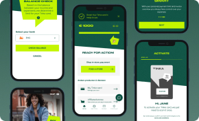
Boost Engagement Through Tailored UX/UI Design
Designing Impactful Digital Experiences That Foster Connection and Increase Sales
Discover UI/UX DesignAt the cost of the performance and the development time, both these approaches are not without their pros and cons. Responsive design is usually faster to design and more accessible to update than a site that is developed for specific devices. However, it is not as optimized for performance on every device, which might be a drawback. Adaptive design is, therefore, likely to be slightly more time-consuming to implement because the designer has to create multiple layouts, but the outcome is a better performance on the key devices.
It is necessary to note that the decision to use one or another method to create a website should depend upon the general conception and objectives of the web project.
What is Responsive Design?
Responsive design is a concept that focuses on the designing of a website in a way that fits every device, be it a tablet, a laptop, or an iPhone, in every position: in portrait or in landscape. The layout and content are responsive to the device used through features such as a fluid grid, Flexible images, and CSS media queries. This means that no matter whether a user is accessing the website on a smartphone, tablet, or any other device, including the computer monitor, the website will adjust its layout to fit into your screen.
Hence, the website’s usability and accessibility do not degrade on a smaller screen. This flexibility not only improves users’ satisfaction but also reduces the workload of maintaining a website since no more versions of a page are required.
Key Characteristics of Responsive Design
Several indications define responsive design as a single entity and guarantee the proper working of a site across all devices. These characteristics render responsive design an effective solution to modern web design, providing a consistent and effective user experience on an increasingly expanding multitude of devices.
Fluid layouts
First of all, it is necessary to note that fluid layouts are among the primary elements of responsive design. These layouts use relative measures like percentages instead of absolute measures like pixels, and as such, the elements adapt in proportion to the size of the screen. This makes it possible to achieve the right layout and style of the website and press them to adhere to small mobile devices or large computer monitors.
Media Queries
Secondly, media queries are one of the most important aspects of responsive design. These CSS rules, as the name suggests, use different styles depending on the characteristics of a device’s width, height, and orientation. Media queries allow for the adjustment of various values relative to the dimension at which they are displayed to ensure the appropriate presentation of the website for that particular screen.
Single Codebase
Another essential feature of responsive design is the single code-based strategy. Unlike adaptive design, which calls for designing layouts for multiple devices and having fixed layouts, responsive design typically entails always having one design but changing the code to suit the different screen sizes. This also helps simplify the development process and helps ease the easy handling of the website for updates, etc. Updates and enhancements can be made on all of the devices at the same time, which saves a lot of work that would be done in the future when using it.
Responsive Design Advantages
Efficiency
Responsive design is advantageous due to efficiency. When designers and developers make a single layout that is capable of fitting different sizes and orientations of the screen, it becomes very easy to develop the layouts. Instead of having to design several layouts for the various devices, the responsive design enables the creation of a single code that is used and managed. Besides, it speeds up the first creation stage, as well as the following modifications and additions, guaranteeing that they will be applied to all the devices.
Consistency
The second advantage of responsive design is consistency. There is a layout that changes the design depending on the device’s screen size, but the content looks the same on all devices. This aspect is essential for branding and usability since it helps establish a clear correlation between the design, structure, and content presentation on mobile and web devices. Consistency is something that develops users’ trust and recognition, which in turn increases the level of interest and satisfaction.
Future-Proofing
The general idea of Future-Proofing is a property of the responsive design. This type of layout can be used, especially when new devices of different sizes and with different resolutions keep on coming out now and then. This seems to prevent a website from becoming obsolete in the future when new devices emerge and can ruin the expense that went into the design and development of a unique website. So, when flexibility is built into the framework at the start of a project, it is less likely that drastic changes will be required later, which would decrease the usability and relevance of the site.
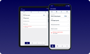
Making Product Discovery Clear and Accessible
Transform Concepts into Products in Four Weeks with Our Proven TechBoost Program
See Product Discovery ServicesWhat is Adaptive Design?
The adaptive approach entails developing several pre-design layouts that are fixed to different categories of devices to achieve the best results. Responsive design changes the layout according to the available space, while adaptive design sets up layouts for every screen resolution and/or orientation. The servers themselves register the sort of device a user uses – a smartphone, tablet, or desktop- and then deliver a corresponding layout.
This approach allows complete control over the look, feel, and behavior of the website on each device. Thus, the site’s users see a highly optimized version for the devices they use.
Key Characteristics of Responsive Design
Multiple Layout
Multiple Layouts are foundational to responsive design in that one design is made for the desktop, another for tablet, and yet another for mobile. Every layout is refined to be as comfortable for the end-user as possible for the given category of devices (e.g., screen sizes 320px, 480px, 760px, etc.). This means that a mobile layout needs to be as minimalistic and touch-friendly as possible, whereas a desktop layout can afford to have a denser and more detailed interface. That is the way adaptive design ensures that users of each of these device types receive a layout that will make the interface natural to them.
Device Detection
Device Detection is another key element of adaptive design that is closely related to the idea of responsive design. As for the second parameter, it is the identification of the type of device using the server or client-side scripts. After that, the system identifies the device type, and the corresponding layout is called so the user stays on the most suitable version of the site for his device. These parameters on which the detection can be based may include but are not limited to, the size of the screen of the device, the operating system, or the type of browser. Adaptive design takes the proper layout and delivers it to the suitable device, providing the best performance and usability across the devices.
Fixed Units
Fixed Units are used in adaptive design to ensure the management of layout elements that fit various devices. While in responsive web design, percentages are frequently used to create layouts, adaptive design usually corresponds to the use of pixels. This also makes it possible for the designer to set the size and the location of the elements; the designer is also assured of the outcome and appearance of the layout on these devices. Despite the fact that it can result in additional work in designing and configuring several layouts, it offers the benefit of providing a refined and coherent experience that is optimized for each device.
Adaptive Design Advantages
Optimization
Adaptive design provides clear benefits, one of which is precise Optimization. Since numerous fixed layouts have been developed to correspond to various devices, each of them can be optimized to the smallest detail. This approach enables the designers to anticipate the multiple aspects of the varieties of devices and their limitations, including the size of the screens, the resolution, and the ways of interacting with the gadgets.
Therefore, the users get an interface that is best suited to fit their device, hence enhancing the ease of use and making it enjoyable. For instance, one layout can be optimized for touch interaction and to load faster on a mobile device, while another can be more informative and contain extra options for the desktop.
Faster Loading Times
Another advantage of the adaptive design is Faster Loading Times. As the server is aware of the type of device accessing the website and is able to send only the code and resources required for that particular layout, the overall size of the pages is small, and hence, the page loading times. This efficiency is essential, especially for mobile users who will be accessing the internet via their mobile devices, thus potentially slowing the internet connection and limiting the data used.
It makes it possible to minimize the amount of code and other assets that would need to be downloaded by the browser, thus making the web pages load faster and improving the general usability of the sites. Besides enhancing ease of use, a quicker loading time is also a boon for SEO since it is an essential factor that affects websites’ ranking.
Key Differences Between Responsive and Adaptive Design
Flexibility and Fluidity
Responsive Design is more flexible and fluid in nature; it adapts itself to the screen size of the device being used by the visitor. This method makes it possible for one layout to fit different dimensions of the screen and, therefore, allows a coherent experience between the devices. Responsive web design enables the site to shrink, resize, and reformat for optimum usability and looks without the need to have a number of sites for different devices through the use of fluid grids, flexible images, and media queries.
In turn, Adaptive Design offers even more control and more options for adjusting the site as it sends particular versions of the site depending on the recognized device. This approach involves developing designs that are unique for specific screen dimensions and pixel densities. Though it requires more time investment at the beginning, it also lets the designers adjust each version to their best performance and user experience on the targeted devices.
Development Complexity
Responsive Design is usually implemented with the help of one code and design version, which is easier to create and support. This approach makes development more accessible and more effective in the sense that changes and updates will need to be made in one place before they are disseminated to different devices. Minimizing the number of designs and the ability to change them so that they can fit into a single mold has the advantage of less maintenance in the long run and less funds used on development.
Adaptive Design can be difficult and time-consuming when creating a site since the designer will have to design and develop several versions. Depending on the device type, be it Desktop, Tablet, or Mobile, there should be a different format and, at times, a completely different set of codes. This approach is best used when the researcher fully understands each device’s properties and can lead to a higher workload during both development and later on.
Custom Software Perfectly Aligned with Your Strategic Objectives
Software Solutions that Fit and Enhance Your Business Strategy
Explore Custom SoftwareDevice Optimization
Responsive Design makes the website adapt to device features; hence, the same experience is felt across the different devices, though it does not optimize for the specific device. That is why, although it is a general target that is effective for a broad audience, it can sometimes sacrifice speed and detailed handling of particular functions for specific devices. This can result in a suboptimal experience for some of the devices, particularly those with particular features.
Adaptive Design defines more differences according to the capabilities and limitations of devices, thus providing the best experience for each category of devices. It is evident that adaptive design has the advantage of creating specific layouts for each device, which can then take advantage of the particular strengths of the device while minimizing its weaknesses, hence making the interaction between the user and the device more efficient. This makes sense because it can yield a drastic improvement in user satisfaction depending on the type of device used by the client.
Future-Proofing
Responsive Design is regarded as more future-oriented since it is easier to integrate new devices and screen resolutions into the layout. In particular, its modularity enables it to support existing and future devices with minimal enhancements. When new screen sizes and resolutions appear, the responsive design remains useful for the user with just a little modification.
Adaptive Design may need new versions or adaptations as new devices or resolutions come out. Since it presupposes unique layouts for various devices, the appearance of new sizes of screens or new technologies might lead to extra work on layout and development. That can raise the long-term support costs and also make necessary more frequent revisions to match the present devices.
Choosing the Right Approach
The factors that define whether to use responsive or adaptive design include the audience, project necessity, and cost. If you are looking forward to having a large number of people engage with your site across all devices while at the same time using the same version of the site, then the concept of a responsive site will definitely suit you more than the concept of a hybrid site, especially because designing and commonly maintaining a responsive site is relatively easier.
If, however, your project requires refined optimization for specific devices and the goal is to supply users with an originally customized experience enhanced by the specific features of the device, and you are ready to manage the increased degree of complexity and adaptability, then adaptive design would be preferable. Hence, the knowledge of your unique needs and limitations will point you in the right direction of the design strategy to use.
When to Use Responsive Design:
- New Websites: Responsive design shines when building a website from scratch. It ensures a consistent experience across all devices.
- Large Websites: Projects with multiple pages benefit from a single codebase and efficient development.
When to Use Adaptive Design:
- Enhancements and Redesigns: Adaptive design suits smaller projects where existing content needs optimization.
- Faster Loading: Adaptive layouts load faster due to targeted code delivery.
Finding the Perfect Fit for Your Digital Presence
Both strategies target a variety of devices and screen sizes. Responsive design is convenient to use and does not require frequent updates, while adaptive design creates different layouts for various gadgets. The most suitable design strategy will be determined based on the project characteristics and expected outcomes, as well as an analysis of the target audience’s needs. From the focus on responsiveness to the focus on adaptability, improving the utility of the designs across multiple devices should improve user satisfaction.
IT Consultancy for Strategic Advantage
Tailored IT Solutions to Drive Your Business Forward
Discover IT ConsultingLet’s meet and start analyzing the best fit for you!