Our HyperSense team has produced a multitude of software development projects using Figma for several years now. This powerful design tool empowers our designers to craft visual artifacts that illustrate the desired user flows effectively. In this guide, we share our streamlined process for setting up the project’s Figma design implementation.
Boost Engagement Through Tailored UX/UI Design
Designing Impactful Digital Experiences That Foster Connection and Increase Sales
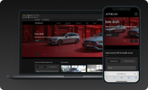
Discover UI/UX DesignOne such project that stands out is “Autoklass: Building a Unified Online Experience for Luxury Car Sales and Services”. We invite you to delve into the Autoklass project to better understand our process and see our approach in action.
The first step in our process is to create a new Figma file and assign it an informative and useful name. We often use a combination of the project title (or code name) and the client’s name. A name like “Autoklass: Building a Unified Online Experience for Luxury Car Sales and Services” serves two main purposes: it clearly indicates the project and client it relates to, and assures the file’s user that they are in the right place.
Setting Up Figma File’s Pages for Software Development Project
To commence a software development project, two main pages are created in the Figma design file. These pages serve as the design repositories within the Figma file. The first, known as the “Application” or “Visual Designs” page, hosts the application screens and user flows, integral to any Figma design implementation. The second, named the “Components” page, houses the master components used throughout the project.
Positioned beneath the Application page is the Component page. The reason for this placement stems from the frequency of access during the initial stages of design execution. In the early stages of Figma design implementation for a software development project, the Application page is referred to more frequently due to its role in framing the user experience and flows.
To make the distinctions between the Application and Component pages easier to see, add an emoji with a few spaces before the name. Use whatever works for you. We often use the puzzle piece for the component page and the picture frame for the application page.
The Layout of an Application Page
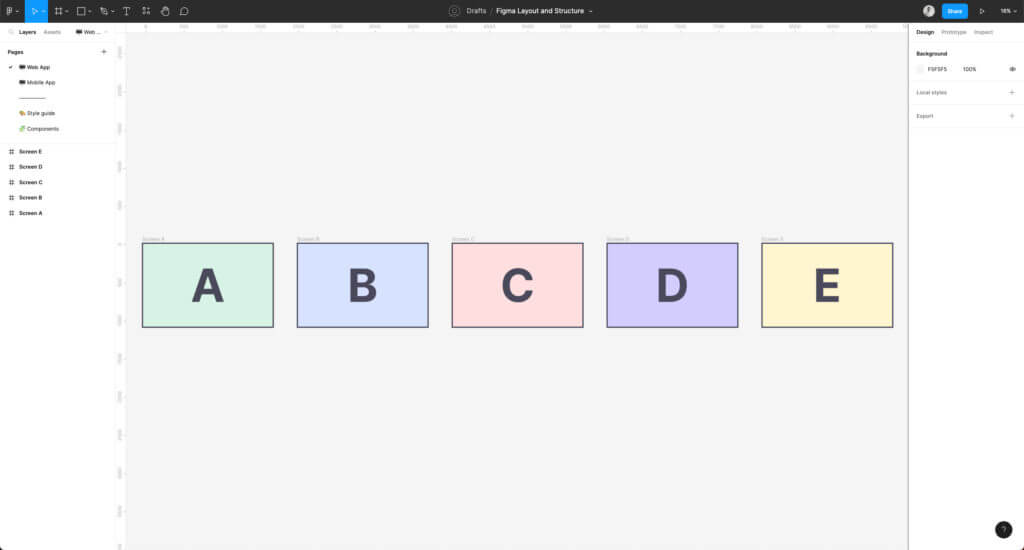
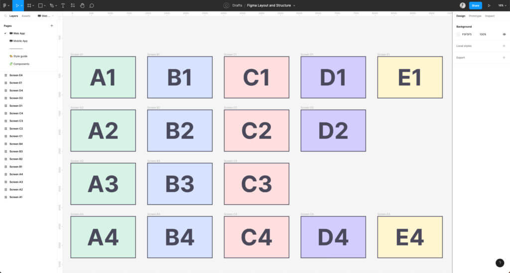
This page will provide the majority of application pages in a site map format at the conclusion of the design phase. But, we usually start by arranging the initial flow from left to right, then build up and down, keeping in mind a logical grouping of functionality. We frequently put off worrying about naming artboards until the application panels have considerable intricacy or depth. A logical grouping is frequently required at one or more places. It is a perfect moment to give your artboards new names.
When viewing the artboards, you can use arrows and choose flow diagram items to help you record the user’s progress. We’ll describe the required user flow using the Process element and we’ll explain how a user might arrive at a certain screen using the Decision element.
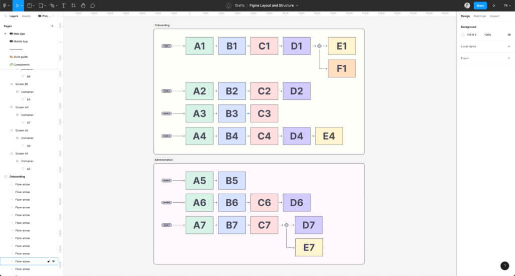
When zoomed far out from the specifics of the dartboards, adding labels and visual groupings can aid wayfinding as the application page becomes more complex. If the amount of content becomes too much, these various sections may need to be divided into two separate pages.
The Layout of a Component Page in a Software Development Project
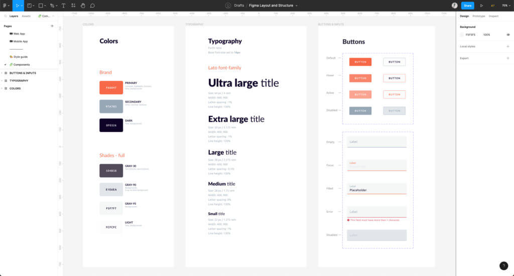
The second page serves as the component repository in our Figma design implementation process. Components are reusable elements, and any modification made to a master component reflects on all of its instances. This characteristic enables both simplicity and complexity in design, catering to varying requirements of a software development project. To maintain order and ease of visual scanning for specific master components, we typically arrange them in a grid format. From simpler elements to those of increased complexity, components can be subsidiary or multi-faceted, depending on their use and role.
The components are replicated from the design system’s components list if the team is employing a design system like Angular Material, React Bootstrap, or a similar one. In the context of Figma design implementation, it is crucial that these component names align with those in the design system. For instance, if you’re using Angular Material, the chosen component should be named “mat-select”. This consistency not only keeps the design coherent but also aids in easier communication and smoother execution of the software development project.
Redefine Your IT Strategy with Our Consultancy
Customized Solutions for Optimal Performance
Discover IT ConsultingWhen creating variations of components, the naming convention for the design system should also be followed. Variants are closely similar but slightly distinct parts. Using primary and secondary buttons is a prime example. The Figma component’s variant properties ought to correspond to the design systems. For the primary and secondary button styling, React Bootstrap uses variant=”primary” and variant=”secondary.” In the Figma component, we would anticipate “variant” as the property variable that would allow “primary” and “secondary” as variant possibilities.
By speaking the same language, design, and development will become more closely coupled as a result of the alignment of components and variation names. The friction between designers and developers while discussing a variant of a component is reduced if both parties use the same vocabulary. Similarly, when the component’s variants match the documentation of the design system, developers are likely to find it easy to evaluate designs for implementation.
Team Sharing
While inviting your team is wonderful, consider allowing non-designers or people unfamiliar with Figma read-only access. Unfamiliar users may move or delete objects unintentionally.
Evaluate the designs with the staff on a regular basis so that they are comfortable navigating the pages. Ensure that everyone understands how to analyze artboards and identify components utilized in order to guarantee that you’re using the correct components and not repeating work.
Things will continue to expand and become more sophisticated as your project progresses, which is just natural.
Discover the seamless communication, high quality design, software development and consultancy services by partnering with HyperSense Software for your future mobile or web app. Your idea and vision, together with our expertise and comprehensive actions will provide the success of your business by accelerating digital transformation and growth. Contact us today and trust us to lead the way.
Leading Development Teams for Your Success
Optimize Your Project Execution with Our Dedicated Development Teams
Get Your Development Team