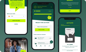
This comprehensive whitepaper examines the processes involved in designing a fashion retail Magento ecommerce app as an MVP. The app includes essential Magento ecommerce functionalities such as viewing and filtering products, adding products to the cart, and checkout. Our team successfully completed this challenge in 10 days.
Begin Your Digital Transformation Journey
Customized Strategies to Lead Your Business into the Digital Age
Explore Digital TransformationProject Brief
Our goal was to identify problems and/or opportunities in an existing ecommerce mobile application and apply our expertise in designing an effective solution.
We focused on designing a clothing retail app from scratch, with insights applicable to most fashion retailers with an ecommerce presence. We chose Magento as our platform due to its stability and extensive set of ecommerce features.
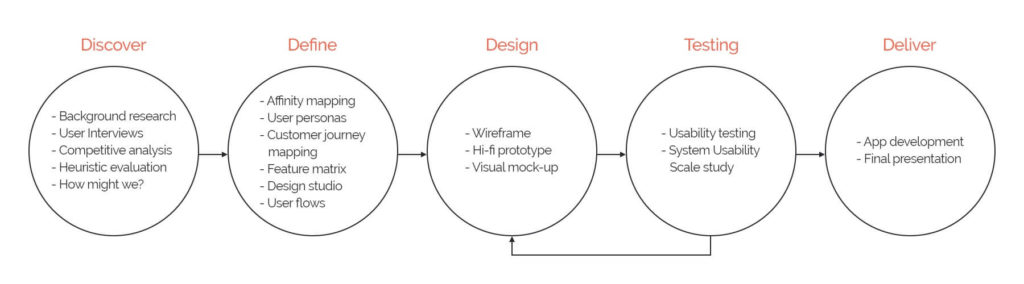
This 10-day design project engaged a team of 4 members (UI/UX Designer, Technical Lead, iOS Developer, Android Developer) and encompassed the following processes and methodologies:
- Discover
- Background research
- User interviews
- Competitive analysis
- Heuristic evaluation
- “How might we?” exploration
- Define
- Affinity mapping
- User personas
- Customer journey mapping
- Feature matrix
- Design studio
- User flows
- Design
- Wireframes
- High-fidelity prototypes
- Visual mock-ups
- Testing
- Usability testing
- System Usability Scale study
- Deliver
- App development
- Final presentation
In this whitepaper, we delve into each step of the design and development process, providing valuable insights and best practices for creating a successful Magento ecommerce app.
The Challenges in Fashion Retail
Staying competitive in the fashion retail industry has become increasingly difficult due to factors such as high rental fees for maintaining a physical store and challenges in hiring lower-skilled sales assistants.
Moreover, consumers are gravitating towards online shopping platforms such as Amazon, ASOS, and Thredup for their fashion needs. Large fashion retailers like ZARA, Bershka, and H&M have also developed online shops and e-commerce apps, further intensifying the competition in the market.
Understanding the Competitive Landscape
In light of these challenges, we aimed to create a superior shopping experience by researching and analyzing three leading mobile apps in the fashion retail space: River Island, H&M, and Sports Direct. By studying their features, user experience, and overall performance, we sought to identify areas of improvement and opportunities for innovation.
Our goal was to develop a Magento ecommerce app that not only addressed the issues faced by fashion retailers but also offered an engaging, seamless, and user-friendly experience for shoppers. By closely examining the current market landscape and drawing inspiration from successful fashion retail apps, we aimed to create a solution that would give businesses a competitive edge in the ever-evolving world of online fashion retail.
1. Discover
Heuristic Evaluation
We began our research by analyzing existing apps to identify key issues and areas for improvement. We compared our analysis with online reviews on Google Play to understand users’ perspectives.
App reviews
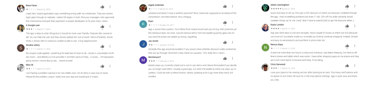
Reviews from H&M app , River Island app and Sports Direct app.
We studied reviews from the H&M, River Island, and Sports Direct apps, focusing on the most critical features of an e-commerce app. The main issues we discovered were:
- Slow loading and occasional login failures;
- Coupons not applying to orders;
- Navigation inconsistencies across the apps;
- Subpar user-friendliness;
- Lengthy checkout times;
- Difficulty finding filters;
- Out-of-stock items still appearing in search results.
Competitive Analysis
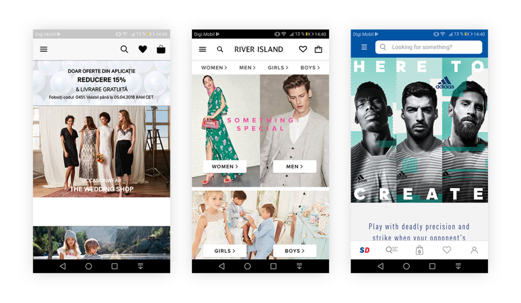
We compared the home screens of our competitors’ apps, selecting them based on their global coverage, ecommerce mobile app presence, similar price range and demographics, and fast-fashion retailer status.
Key findings included:
- Most shoppers were either unaware of the apps’ existence or didn’t use them;
- Brand visibility was lacking;
- Categories were displayed using large banners;
- Navigation primarily relied on side-menus (and a tab bar for Sports Direct);
- App approaches varied: River Island was more editorial, Sports Direct focused on e-commerce, and H&M emphasized fashion.
How Might We?
At the start of the project, we had three main questions in mind.
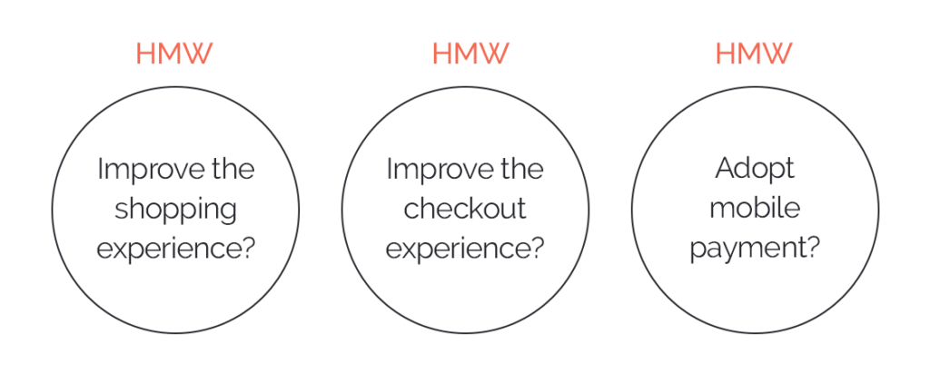
How Might We?
We started the project with three main questions in mind:
- How might we improve the shopping experience?
- How might we enhance the checkout experience?
- How might we adopt mobile payment?
To improve the shopping experience, we aimed to adapt the in-store environment to our Magento ecommerce app. We first defined the unique aspects of a physical store to guide our mobile app adaptation:
- Greeting customers upon entering the shop;
- A familiar shop layout;
- Large images, bright lights, and neatly stacked shelves;
- Regular sales and promotions for various products;
- Easy product discovery without sales assistant support.
To enhance the checkout experience, we focused on creating a streamlined process:
- Clear product addition to cart (with easily accessible quantity selection);
- User-friendly cart with coupon options, product deletion, and quantity adjustment;
- Simple billing with address options and separate shipping addresses, if needed;
- Diverse payment methods;
- A confirmation process that allows users to edit any previous step.
To adopt mobile payment, we aimed to integrate a credit card processing screen with an easy-to-use UI, making transactions simple and efficient for users.
User Interviews
We conducted interviews with five users to gather their opinions on the competitors’ apps, focusing on key aspects common to fashion ecommerce apps. Our questions covered topics such as:
- Browsing for clothes;
- Making a purchase;
- Waiting for delivery;
- Receiving the items.
Key findings from the interviews included:
- Users found the apps easy to browse, with no major navigation issues;
- Frustration stemmed from insufficient filtering options;
- The checkout process was perceived as overly complicated;
- Users desired more clarity on delivery options and fees;
- The apps’ presentations were deemed cluttered;
- Cart items disappeared after exiting the apps, causing inconvenience;
- Some fonts were considered too light and small, impacting readability.
Focus on UI/UX Design to Drive Business Growth
48% of Consumers Consider Design a Key Factor in a Company's Credibility
Discover UI/UX Design2. Define
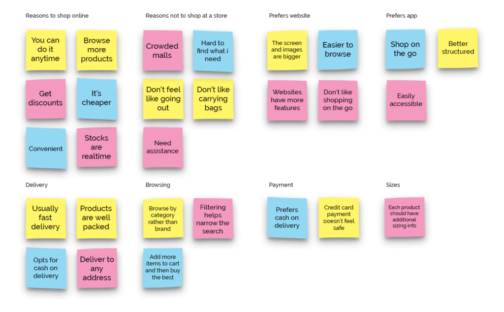
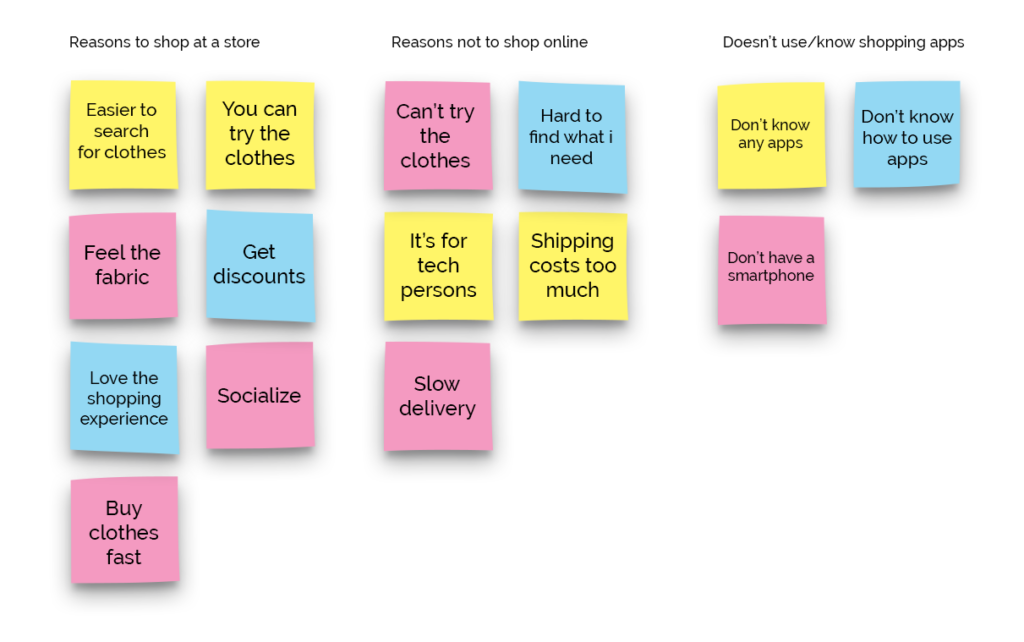
Affinity Mapping
After conducting user interviews, we organised the findings into groups in an Affinity Map. Using this map we could identify common habits, problems, and pain points. This was a key point in designing our Magento ecommerce app.
“Affinity Mapping for Current app user.”
“Affinity Mapping for Potential app user.”
User Personas and Customer Journey Map
Based on the patterns identified in the affinity map, we came up with 2 personas – an existing user of the app, and a current shopper who is a potential user of the app. These personas describe a typical user/potential user, their habits, problems, pain points, and other details about him/her.
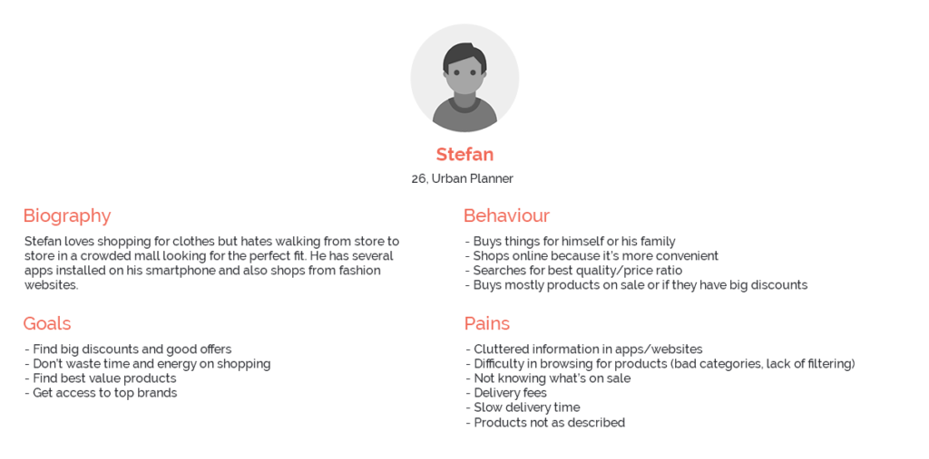
Persona 1 - Existing user of the app
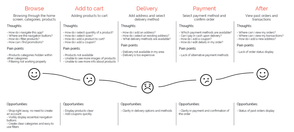
Customer Journey Map – Shopping on the App.”
Stefan prefers to shop online and is an existing user of the app. He wants quick access to all the discounts and finds it difficult to find the size and availability of the items he wants. While he is familiar and comfortable using the app, he hopes the user experience can be improved.
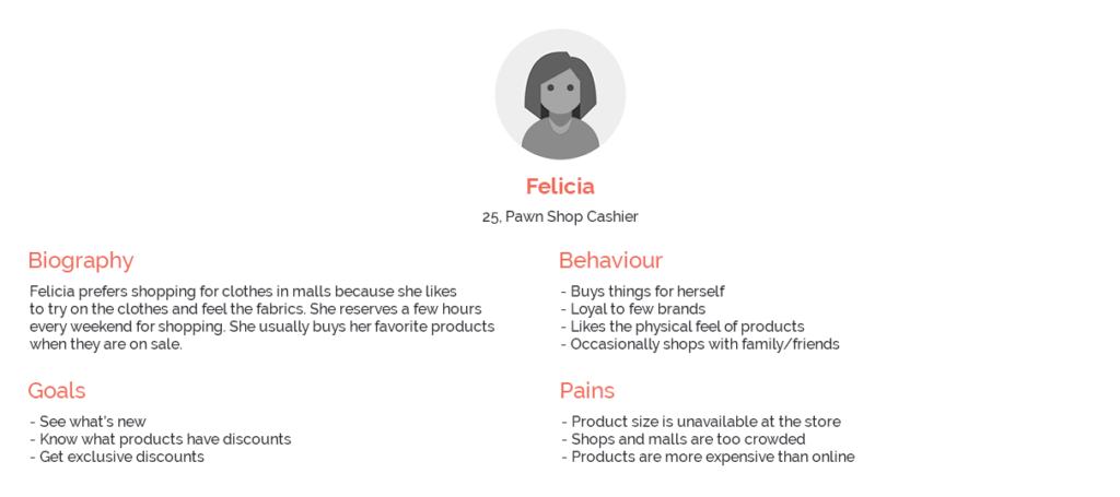
Persona 2 – Existing shopper and potential user of the app
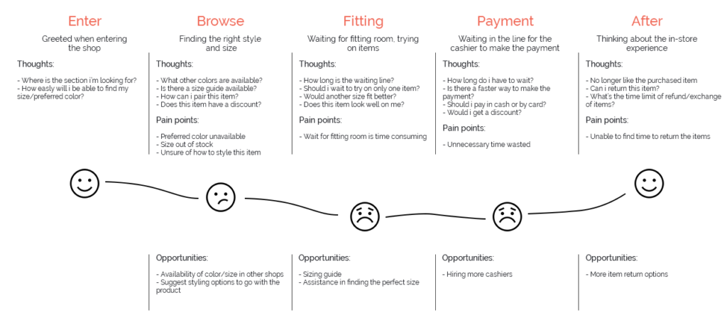
“Customer Journey Map – Shopping at a physical store.”
Felicia shops at the physical store and is not aware of existing apps. She enjoys shopping at the store, but there are often too many clothes and can’t find the perfect ones (price and quality). She may be a potential user of the app since she uses e-commerce websites to shop for clothes.
Potential project approaches:
- App Navigation improvement;
- Easy filtering of the products;
- Straightforward checkout and easy payment;
- Possibility of shopping without an account.
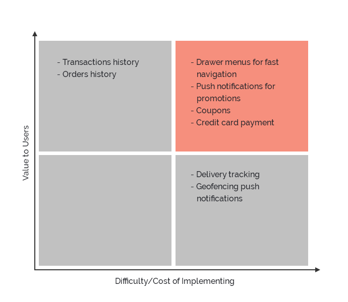
Feature Matrix
Using a design studio process, we came up with various new features we intend to include in the MVP (Minimum viable product). We approached the features from the business perspective and organised them according to users’ and businesses’ needs. The features displayed in the top right corner (the red box) should be included in the app.
User Flows
.png)
3. Design
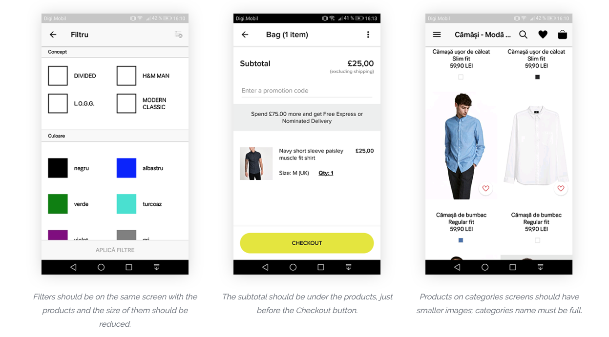
Wireframes
Wireframes of: home, side-menu, categories, view products, adding products to cart, checkout, sign in and sign up.
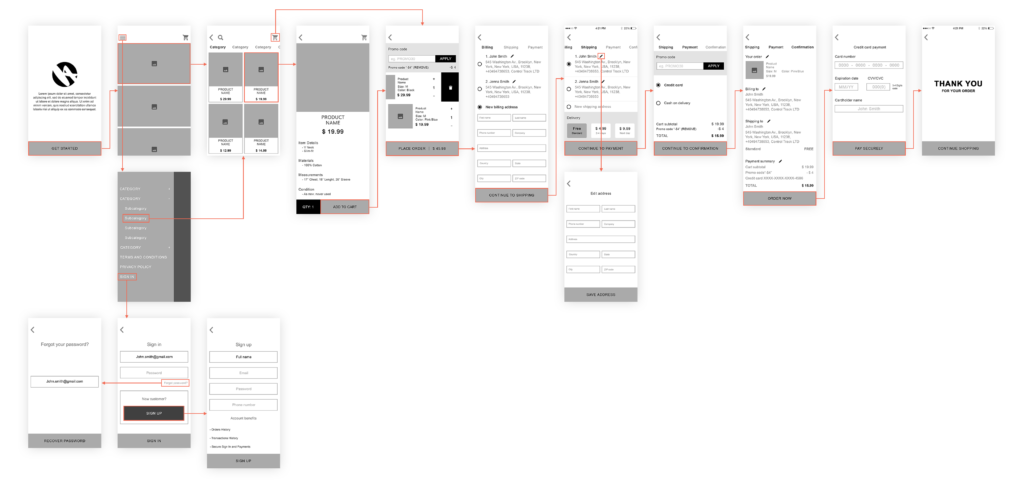
Most designers consider wireframes to be the cornerstone of every project. The same is true for mobile app design. An app wireframe is a simple and useful tool for iterating on mobile apps. Discover How To Build An App Wireframe on our blog.
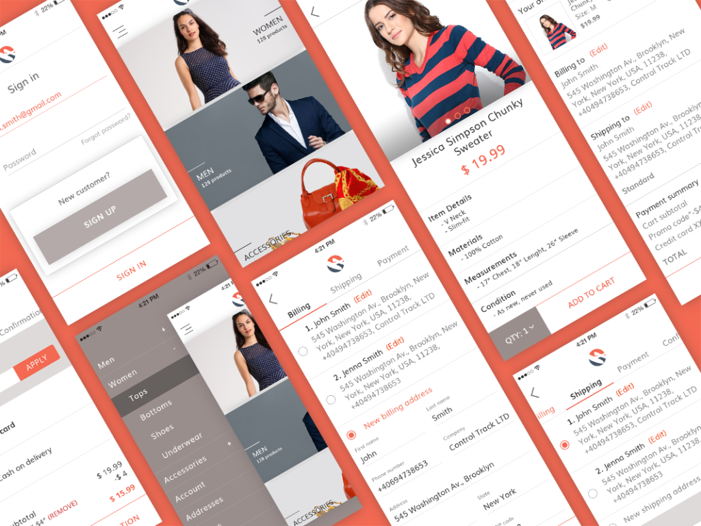
Hi-Fi Prototype
By applying the usability test, we iterated a high fidelity prototype. The interactive prototype can be viewed on Marvelapp.
4. Usability Testing
First Usability Test
We moved straight to creating a high-fidelity prototype after developing quick mock-ups, recognizing the importance of clothing images in helping users visualize the actual app. The color scheme used for this app aligns with our company’s (HyperSense) colors. We tested this version with real users.
Key insights from the usability test:
- Users navigated easily between categories and found products without difficulty;
- The majority of users felt the product screen was clear and informative;
- Users appreciated the option to check out without creating an account;
- Some users expressed a desire for more detailed product information;
- The checkout process was intuitive, and users were satisfied with the time it took;
- Users found account creation quick and the account information useful;
- Microinteractions enhanced the overall user experience.
“Example of microinteraction – Add product to the shopping cart
“Example of microinteraction – Cart drawer”
Web Development Services Tailored to Your Business Needs
Customized Web Solutions to Elevate Your Online Presence
Discover Web Development5. Deliver
Finally, after we have built our product, we need to develop it, in order to see if it can be done or if we have any problems implementing the design. This is where the Android and iOS developers step in and make this product real. We conducted alpha testing and QA testing after it was ready.
If you wish to see the Android and iOS Magento ecommerce app, please contact us and we will send you a download link with the app.